A study reports the decline in production of principal crops under shifting cultivation (jhum) in 16 Mizoram villages beleaguered by challenges of a changing climate and population pressure.
Replacing subsistence crops with economically viable cash crops and converting shifting cultivation-land use systems into permanent plots can sustain livelihoods, the study suggests.
The indigenous farmers practicing shifting cultivation still pursue it despite lack of profits because of socio-cultural linkages, but would prefer a permanent agricultural set-up if government assistance is provided.
Shifting landscapes in the northeast are ‘cultural landscapes’ and any transformation must take into account the prevailing socio-cultural conditions of the people.
In Mizoram’s rugged mountains, telltale signs of climate change and population pressure show on slash-and-burn agriculture (jhum or shifting cultivation) and its indigenous practitioners (jhumias), who soldier on despite production and yield of principal crops taking a hit, a study has observed.
Replacing subsistence crops with profitable cash crops and converting shifting cultivation-land use systems into permanent set-ups can make agriculture potentially profitable provided that such alternatives are sustainable and worthwhile in the given socio-ecological system, the study said.
The study assesses the economic implications of shifting cultivation across the state’s eight districts and also highlights the need for proper implementation of the highly-debated New Land Use Policy (NLUP) that seeks to put an end to shifting cultivation in the state.
Running along a north-south axis, Mizoram lies in the extreme northeastern corner of India. To the south, it tapers off between Bangladesh and Myanmar. Three Indian states Manipur, Assam, and Tripura surround it to the east, north and the west.
Of 21,000 square km spread of the state, only 5.5 percent of it is arable. Compared to the 44,947 hectare that was under jhum in 2007, less than half of the area is now used for jhum. The government attributes this reduction to a switch from shifting agriculture to oil palm, sugarcane, and to activities under policies such as the NLUP.
Most survey respondents feel jhum not economically viable
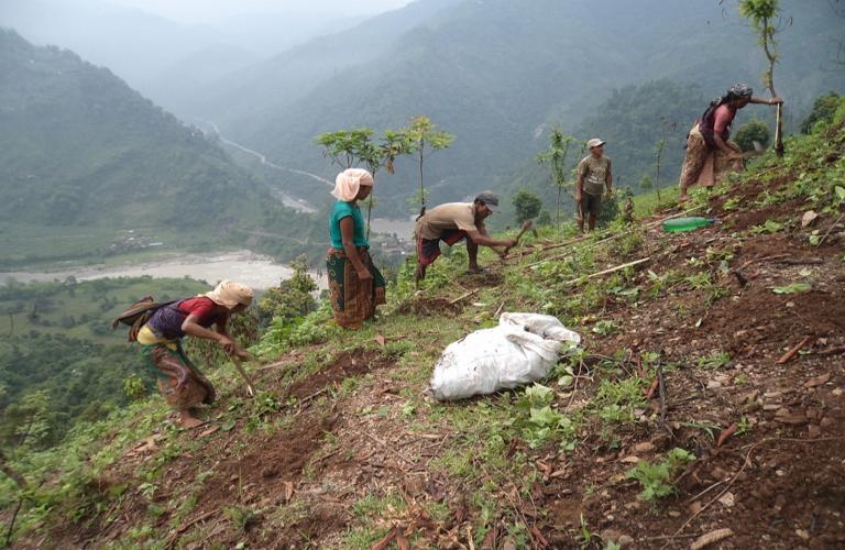
For the study, as many as 815 jhumias (marginalised indigenous farmers) from 16 villages in eight Mizoram districts were interviewed during August to November 2018, on the economic viability of jhum and their perceptions of a changing climate. Satellite data was used to gauge changes in the jhum plots and abandoned patches (fallow land).
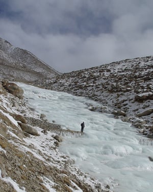
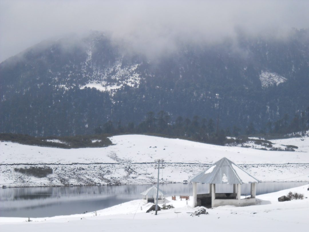
In these 16 study villages, along the precipitous slopes of Mizoram perched in the eastern Himalayas, a jhum crop system unfolds over an eight to ten-month period.
Farmers engaged in shifting cultivation reside in temporary huts during the cropping season. Photo by VP Sati.
As January sets in, jhumias or marginalised shifting cultivation practitioners start clearing trees and grasses inside forests that are largely under bamboo cover in the state. These fragmented patches of land (jhumlands) roughly 0.7 hectares in area, controlled by village assemblies, are temporarily distributed to the farmers for a maximum period of two years for cultivation, the researcher said.
In March the plots are set on fire. Seeds are sown with the advent of the monsoons, generally in May, and autumn sees the harvest.
“After one cropping season is over, jhumias may continue for another crop cycle in the same plot or move on to a different patch. Following the cultivation phase, the land is left fallow for a period of three to five years. The village assembly ensures a different set of jhumias gets access to the used land after a fallow period,” study author VP. Sati of Department of Geography and Resources Management, School of Earth Sciences, Mizoram University, Aizawl, told Mongabay-India.
Sati said the jhumlands are rotated between the jhumias such that everybody gets a chance and there is scope for only one crop season in a year because agriculture is dependent on monsoon-which has become scant in the last three decades impacting crop production.
“In 26 years (till 2015), the rainfall in the state has decreased by 1.4 percent on average and the temperature has risen by 0.4 degree Celsius,” said Sati.
Coupled with the scanty rainfall, the fallow period in between jhum cycles has thinned down from 20 to 25 years to three to five years owing to a population boom which has put pressures on land availability for agriculture. The fallout of the reduced fallow period is a drop in soil fertility adding to the impacts of deficient monsoon on crop production.
“Additionally, the new generation is educated and they prefer to work in the tertiary sector,” said Sati. This leaves fewer farmers to take forward the traditional agricultural practice.
Beleaguered by these challenges, production, and yield of the eight principal crops including paddy, chili, ginger, and cabbage, grown under jhum, has declined in the last 17 years (2000–2017) in the study areas. Data shows the production of three principal crops such as paddy has gone down by 2.1 percent, ginger by 15.9 percent and chili by 5.2 percent. According to Sati, data obtained were primarily in a local measurement unit, and these were further converted into hectares. A Mizoram government document states that the most common measurement unit of area in the state is tin, which is approximately equal to an acre.
When asked about the economic viability of jhum, 95 percent of the farmers participating in the survey answered in the negative. And 88 percent of the respondents believe if the government provides financial assistance to connect the fragmented jhum plots and terrace sloppy land to transform into permanent agriculture, then the exercise may become economically beneficial.
Satellite data shows that land under permanent agriculture has remained stable during the four years (2011-2015) while a substantial decrease in active jhumlands is observed in this period. Abandoned jhumlands transitioned into degraded grasslands because shifting cultivation was not continued on these plots after the fallow period.
“Forests have depleted by four percent during the period due to the land-use changes in study villages. Shifting cultivation is practiced exclusively in forest areas. Most of them are located in bamboo forests. Every year, the forests are cut and burnt. As a result, a large-scale degradation of forest and also landscape takes place,” he said.
The burning phase of the shifting cultivation cycle. Photo by VP Sati.
According to India State of Forest Report (2017), the state spread over an area of 21,087 sq km had 91.6 percent of forest cover till 2011 that dropped to almost 86 percent in 2017. The sharp decline is attributed to jhuming, encroachments and development activities.
This apart, the jhumias are also facing numerous hurdles in practicing their tradition – terrain inaccessibility, rugged and rough terrain, infertile soil, steep slopes and distance to the jhum plots. “But a large number of jhumias still practice shifting cultivation and grow subsistence cereals because of socio-cultural linkages and because they do not have other livelihood options,” said Sati.
However, DK Pandey, Department of Social Sciences, College of Horticulture and Forestry, Central Agricultural University, Pasighat, advised that shifting landscapes in the northeast are “cultural landscapeS” and any transformation must take into account the prevailing socio-cultural conditions of the people.
Pandey, who was not associated with the study emphasised that agrodiversity in shifting cultivation is one of the key factors which attract farmers to the practice.
“The shifting cultivation landscape is considered a reservoir of alternative genetic
resources which can provide more opportunities for the
wild relatives of cultivated species having the genetic potential for identifying new genes and allelic variability, as well as several other exploitable economic and environmental benefits that can be harnessed with their conservation and cultivation,” Pandey said in a study.
“Jhuming is mainly for subsistence, it doesn’t give you cash. People want cash now to fulfill their aspirations,” Pant told Mongabay-India.
Pant also elaborated on the paradox in Mizoram.
“Mizoram is the only state in the northeast where the urban population is more than the rural population. 51 percent of Mizoram’s population resides in cities, its villages are basically deserted. But the extent of jhuming is quite high in the state compared to the rest of the northeast states. People go to the jhuming areas, do the jhuming related activities and travel back,” said Pant.
“Other states have more or less reconciled to the fact that jhuming is no longer sustainable in the way it’s done now,” Pant observed.
Farmers open to switching away from jhum if supported with better policies
“With traditional crops taking a hit and population going up, the communities are experiencing food insecurity, malnutrition, and high infant mortality,” said Sati.
In the case study villages, about 37 percent of people are living below the poverty line and 17 percent of people are suffering from chronic poverty. Government data states 35.4 percent of the people in rural areas are below the poverty line, said Sati pointing out the difference in datasets.
Sati said if the ownership of jhum plots is extended to the communities for a longer period then they can switch to cash crops by terracing the jhum slopes, enabling them to foster a permanent agricultural setup that affords them greater economic gains and nutrition.
“If they have ownership, then they will be more inclined to conserve the land and practice agriculture that doesn’t harm the biodiversity,” he said.
Targetted approaches such as enhancing paddy production for food security and focusing on ginger and cabbage, which are the two important cash crops grow in Mizoram, are a few ways to bolster financial gains from agriculture.
“The production and yield of ginger and cabbage are substantial. However, due to a lack of market facilities, the economic output of ginger and cabbage is not considerable. Value addition through making spices and pickles of ginger will enhance the income and livelihood of the jhumias. Similarly, cabbage production can be increased by putting more arable land under its cultivation. Maize, mustard, pumpkin, chili, and eggplants can substantiate food requirements in the rural areas thus, their production can be increased,” explained Sati.
“Mizoram is now going for floriculture and there are some good success stories. For example, they are now exporting products such as cut flowers to southeast Asian countries. Food processing is also coming up,” added Pant.
The New Land Use Policy (NLUP) seeks to put an end to shifting cultivation, engaging people in alternative livelihoods and for granting land ownership, said Sati.
The Congress government launched the NLUP when it acquired power in 2008. It had tried to implement similar policies during its previous two tenures from 1985-1992 and 1993-1998 but without much success. The NLUP was implemented in 2011 with some modifications and a better framework following the suggestions from the Centre that envisaged a five-year-project with a staggering budget of Rs. 2,800 crores (Rs. 28 billion).
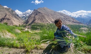
A mixed cropping jhum landscape. Photo by VP Sati.
NLUP has failed to strike a chord with a section of the farmers who switched to alternative livelihood options but are now going back to shifting cultivation because of the policy’s shoddy execution.
“As Mizoram gets warmer, the importance of executing such policies an“The policy is not implemented properly because of the changes in government and misuse of funds. Shifting cultivation still continues. States such as Arunachal Pradesh and Nagaland have transformed jhumlands to permanent plots,” observed Sati. coming up with approaches that afford ownership to farmers over their lands and extending financial and technical assistance to try out agricultural innovation is the need of the hour,” professor Sati added.
A joint report from The Hamilton Project and the Stanford Institute for Economic Policy Research
INTRODUCTION: SCIENTIFIC BACKGROUND
Substantial Biophysical Damages Will Occur in the Absence of Strong Climate Policy Action
The world’s climate has already changed measurably in response to accumulating greenhouse gas (GHG) emissions. These changes as well as projected future disruptions have prompted intense research into the nature of the problem and potential policy solutions. This document aims to summarize much of what is known about both, adopting an economic lens focused on how ambitious climate objectives can be achieved at the lowest possible cost.
Considerable uncertainties surround both the extent of future climate change and the extent of the biophysical impacts of such change. Notwithstanding the uncertainties, climate scientists have reached a strong consensus that in the absence of measures to reduce GHG emissions significantly, the changes in climate will be substantial, with long-lasting effects on many of Earth’s physical and biological systems. The central or median estimates of these impacts are significant. Moreover, there are significant risks associated with low probability but potentially catastrophic outcomes. Although a focus on median outcomes alone warrants efforts to reduce emissions of GHGs, economists argue that the uncertainties and associated risks justify more aggressive policy action than otherwise would be warranted (Weitzman 2009; 2012).
The scientific consensus is expressed through summary documents offered every several years by the United Nations–sponsored Intergovernmental Panel on Climate Change (IPCC). These documents indicate the projected outcomes under alternative representative concentration pathways (RCPs) for GHGs (IPCC 2014). Each of these RCPs represents different GHG trajectories over the next century, with higher numbers corresponding to more emissions (see box 1 for more on RCPs).
The expected path of GHG emissions is crucial to accurately forecasting the physical, biological, economic, and social effects of climate change. RCPs are scenarios, chosen by the IPCC, that represent scientific consensus on potential pathways for GHG emissions and concentrations, emissions of air pollutants, and land use through 2100. In their most-recent assessment, the IPCC selected four RCPs as the basis for its projections and analysis. We describe the RCPs and some of their assumptions below:
RCP 2.6: emissions peak in 2020 and then decline through 2100.
RCP 4.5: emissions peak between 2040 and 2050 and then decline through 2100.
RCP 6.0: emissions continue to rise until 2080 and then decline through 2100.
RCP 8.5: emissions rise continually through 2100.
The IPCC does not assign probabilities to these different emissions pathways. What is clear is that the pathways would require different changes in technology and policy. RCPs 2.6 and 4.5 would very likely require significant advances in technology and changes in policy in order to be realized. It seems highly unlikely that global emissions will follow the pathway outlined in RCP 2.6 in particular; annual emissions would have to start declining in 2020. By contrast, RCPs 6.0 and 8.5 represent scenarios in which future emissions follow past trends with minimal to no change in policy and/or technology.
The four RCPs imply different effects on global temperatures. Figure A indicates the projected increases in temperature associated with each RCP scenario (relative to preindustrial levels).[1] The figure suggests that only the significant reductions in emissions underlying RCPs 2.6 and 4.5 can stabilize average global temperature increases at or around 2°C. Many scientists have suggested that it is critical to avoid increases in temperature beyond 2°C or even 1.5°C—larger temperature increases would produce extreme biophysical impacts and associated human welfare costs. It is worth noting that economic assessments of the costs and benefits from policies to reduce CO2 emissions do not necessarily recommend policies that would constrain temperature increases to 1.5°C or 2°C. Some economic analyses suggest that these temperature targets would be too stringent in the sense that they would involve economic sacrifices in excess of the value of the climate-related benefits (Nordhaus 2007, 2017). Other analyses tend to support these targets (Stern 2006). In scenarios with little or no policy action (RCPs 6.0 and 8.5), average global surface temperature could rise 2.9 to 4.3°C above preindustrial levels by the end of this century. One consequence of the temperature increase in these scenarios is that sea level would rise by between 0.5 and 0.8 meters (figure B).
Countries’ Relative Contributions to CO2 Emissions Are Changing
The extent of climate change is a function of the atmospheric stock of CO2 and other greenhouse gases, and the stock at any given point in time reflects cumulative emissions up to that point. Thus, the contribution a given country or region makes to global climate change can be measured in terms of its cumulative emissions.
Up to 1990, the historical responsibility for climate change was primarily attributable to the more-industrialized countries. Between 1850 and 1990, the United States and Europe alone produced nearly 75 percent of cumulative CO2 emissions (see figure C). Such historic responsibility has been a primary issue in debates about how much of the burden of reducing current and future emissions should fall on the shoulders of developed versus developing countries.
<img class=”aligncenter wp-image-619313 size-article-outset lazyload” src=”https://i1.wp.com/www.brookings.edu/wp-content/uploads/2019/10/20191018_ES_THP_ClimateFacts_Figure_C.jpg” alt=”Share of Cumulative CO2 Emissions by Geographic Region, 1850-1990 and 1850-2017″ />
Although the United States and other developed nations continue to be responsible for a large share of the current excess concentration of CO2, relative contributions and responsibilities are changing. As of 2017, the United States and Europe accounted for just over 50 percent of cumulative CO2 emitted into the atmosphere since 1850. A reason for this sharp decline (as indicated in figures C and D) is that CO2 emissions from China, India, and other developing countries have grown faster than emissions from the developed countries (though amongst major economies, the United States has one of the highest rates of per capita emissions in the world and is far ahead of China and India [Joint Research Centre 2018]). Therefore, it seems likely that in order to avert the worst effects of climate change, emissions reduction efforts will be required by both historic contributors—the United States and Europe—as well as more recently developing countries such as China and India.
<img class=”aligncenter wp-image-619313 size-article-outset lazyload” src=”https://i1.wp.com/www.brookings.edu/wp-content/uploads/2019/10/20191018_ES_THP_ClimateFacts_Figure_D.jpg” alt=”Annual CO2 Emissions by Geographic Region, 1950-2017″ />
Nations’ Pledges under the Paris Agreement Imply Significant Reductions in Emissions, but Not Enough to Avoid a 2°C Warming
The future of climate change might seem dismal in light of the recent increase in global emissions as well as the potential future growth in emissions, temperatures, and sea levels under RCPs 6.0 and 8.5. Failure to take any climate policy action would lead to annual emissions growth rates far above those that would prevent temperature increases beyond the focal points of 1.5°C and 2°C (figure E). As indicated earlier, cost-benefit analyses in various economic models lead to differing conclusions as to whether it is optimal to constrain temperature increases to 1.5°C or 2°C (Nordhaus 2007, 2016; Stern 2006).[2] Fortunately, countries have been taking steps to combat climate change, referred to in figure E as “Current policy” (which includes policy commitments made prior to the 2015 Paris Agreement). Comparing “No climate policies” and “Current policy” shows that the emissions reduction implied by current policies will lead to roughly 1°C lower global temperature by the end of the century. A large share of this lowered emission path is attributable to actions by states, provinces, and municipalities throughout the world.
Further reductions are implied by the 2015 Paris Agreement, under which 195 countries pledged to take additional steps. The Paris Agreement’s pledges, if met, would keep global temperatures 0.5°C lower than “Current policy” and about 1.5°C lower than “No climate policy” in 2100 (see figure E). Although this can be viewed as a positive outcome, a morenegative perspective is that these policies would still allow temperatures in 2100 to be 2.6 to 3.2°C above preindustrial levels—significantly above the 1.5 or 2.0°C targets that have become focal points in policy discussions.
In the following set of facts, we describe the costs of climate change to the United States and to the world as well as potential policy solutions and their respective costs.
Fact 1: Damages to the U.S. economy grow with temperature change at an increasing rate.
The physical changes described in the introduction will have substantial effects on the U.S. economy. Climate change will affect agricultural productivity, mortality, crime, energy use, storm activity, and coastal inundation (Hsiang et al. 2017).
In figure 1 we focus on the economic costs imposed by climate change in the United States for different cumulative increases in temperature. It is immediately apparent that economic costs will vary greatly depending on the extent to which global temperature increase (above preindustrial levels) is limited by technological and policy changes. At 2°C of warming by 2080–99, Hsiang et al. (2017) project that the United States would suffer annual losses equivalent to about 0.5 percent of GDP in the years 2080–99 (the solid line in figure 1). By contrast, if the global temperature increase were as large as 4°C, annual losses would be around 2.0 percent of GDP. Importantly, these effects become disproportionately larger as temperature rise increases: For the United States, rising mortality as well as changes in labor supply, energy demand, and agricultural production are all especially important factors in driving this nonlinearity.
Looking instead at per capita GDP impacts, Kahn et al. (2019) find that annual GDP per capita reductions (as opposed to economic costs more broadly) could be between 1.0 and 2.8 percent under IPCC’s RCP 2.6, and under RCP 8.5 the range of losses could be between 6.7 and 14.3 percent. For context, in 2019 a 5 percent U.S. GDP loss would be roughly $1 trillion.
There is, of course, substantial uncertainty in these calculations. A major source of uncertainty is the extent of climate change over the next several decades, which depends largely on future policy choices and economic developments—both of which affect the level of total carbon emissions. As noted earlier, this uncertainty justifies more aggressive action to limit emissions and thereby help insure against the worst potential outcomes.
It is also important to highlight what figure 1 leaves out. Economic effects that are not readily measurable are excluded, as are costs incurred by countries other than the United States. In addition, if climate change has an impact on the growth rate (as opposed to the level) of output in each year, then the impacts could compound to be much larger in the future (Dell, Jones, and Olken 2012).[3]
Fact 2: Struggling U.S. counties will be hit hardest by climate change.
The effects of climate change will not be shared evenly across the United States; places that are already struggling will tend to be hit the hardest. To explore the local impacts of climate change, we use a summary measure of county economic vitality that incorporates labor market, income, and other data (Nunn, Parsons, and Shambaugh 2018), paired with county level costs as a share of GDP projected by Hsiang et al. (2017).[4]
Figure 2 shows that the bottom fifth of counties ranked by economic vitality will experience the largest damages, with the bottom quintile of counties facing losses equal in value to nearly 7 percent of GDP in 2080–99 under the RCP 8.5 scenario (a projection that assumes little to no additional climate policy action and warming of roughly 4.3°C above preindustrial levels).[5] Counties that will be hit hardest by climate change tend to be located in the South and Southwest regions of the United States (Muro, Victor, and Whiton 2019). Rao (2017) finds that nearly two million homes are at risk of being underwater by 2100, with over half of those being located in Florida, Louisiana, North Carolina, South Carolina, and Texas. More-prosperous counties in the United States are often in the Northeast, upper Midwest, and Pacific regions, where temperatures are lower and communities are less exposed to climate damage.
An important limitation of these estimates is that they assume that population in each county remains constant over time (Hsiang et al. 2017).[6] To the extent that people will adjust to climate change by moving to less-vulnerable areas, this adjustment could help to diminish aggregate national damages but may exacerbate losses in places where employment falls. Moreover, the limited ability of low-income Americans to migrate in response to climate change exposes them to particular hardship (Kahn 2017).
The concentration of climate damages in the South and among low-income Americans implies a disproportionate impact on minority communities. Geographic disadvantage is overlaid with racial disadvantage (Hardy, Logan, and Parman 2018), and Black, Latino, and indigenous communities are likely to bear a disproportionate share of climate change burden (Gamble and Balbus 2016).
Fact 3: Globally, low-income countries will lose larger shares of their economic output.
Unlike other pollutants that have localized or regional effects, GHGs produce global effects. These emissions constitute a negative spillover at the widest scale possible: For example, emissions from the United States contribute to warming in China, and vice versa. Moreover, some places are much more exposed to economic damages from climate change than are other places; the same increase in atmospheric carbon concentration will cause larger per capita damages in India than in Iceland.
This means that carbon emissions and the damages from those emissions can be (and, in fact, are) distributed in very different ways. Figure 3 shows impacts on per capita GDP based on a study of the GDP growth effects of warming, highlighting the relatively high per capita income reductions in Latin America, Africa, and South Asia (though higher-income countries would lose more absolute aggregate wealth and output because of their higher levels of economic activity). The figure also uses a higher estimate of potential economic damages that takes into account impacts on productivity and growth that accumulate over time as opposed to looking at snapshots of lost activity in a given year. Thus, the estimates are higher than those presented in facts 1 and 2, highlighting both the uncertainty and the potentially disastrous outcomes that are possible.
Beyond showing the potentially destructive scale, this map suggests global inequity: Several of the regions that contribute relatively little to the climate change problem—regions with relatively low per capita emissions—nevertheless suffer relatively high climate damages per capita.
Fact 4: Increased mortality from climate change will be highest in Africa and the Middle East.
The reductions in economic output highlighted in fact 3 are not the only damages expected from climate change. One important example is the effect of climate change on mortality. In places that already experience high temperatures, climate change will exacerbate heat-related health issues and cause mortality rates to rise.
Figure 4 relies on estimates from Carleton et al. (2018) to show climate change’s expected effects on mortality in 2100. The geographical distribution of the impact on mortality is very uneven. Some of the most-significant impacts are in the equatorial zone because these locations are already very hot, and high temperatures become increasingly dangerous as temperatures rise further. For example, Accra, Ghana is projected to experience 160 additional deaths per 100,000 residents. In colder regions, mortality rates are sometimes predicted to fall, reflecting decreases in the number of dangerously cold days: Oslo, Norway is projected to experience 230 fewer deaths per 100,000. But for the world as a whole, negative effects are predominant, and on average 85 additional deaths per 100,000 will occur (Carleton et al. 2018).
Also evident in figure 4 is the role of income. Wealthier places are better able to protect themselves from the adverse consequences of climate change. This is a factor in projections of mortality risk from climate change: the bottom third of countries by income will experience almost all of the total increase in mortality rates (Carleton et al. 2018).
Mortality effects are disproportionately concentrated among the elderly population. This is true whether the effects are positive (when dangerously cold days are reduced) or negative (when dangerously hot days are increased) (Carleton et al. 2018; Deschenes and Moretti 2009).
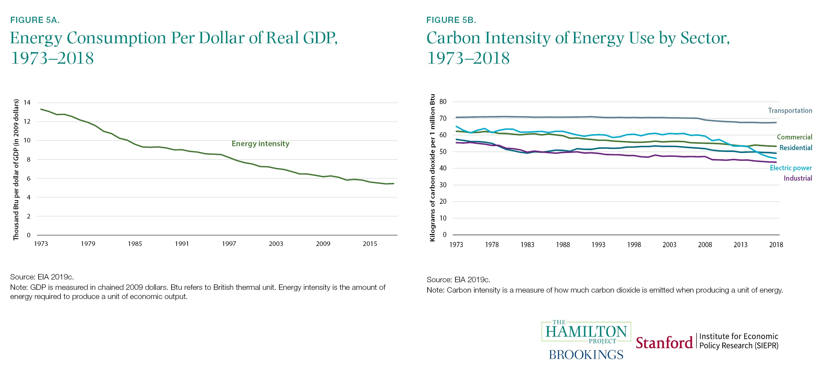
Fact 5: Energy intensity and carbon intensity have been falling in the U.S. economy.
The high-damage climate outcomes described in previous facts are not inevitable: There are good reasons to believe that substantial emissions reductions are attainable. For example, not only has the emissions-to-GDP ratio of the U.S. economy declined over the past two decades, but during the last decade the absolute level of emissions has declined as well, despite the growth of the economy. From a peak in 2007 through 2017, U.S. carbon emissions have fallen 14 percent while output grew 16 percent (Bureau of Economic Analysis 2007–17; U.S. Environmental Protection Agency [EPA] 2007–17; authors’ calculations). This reversal was produced by a combination of declining energy intensity of the U.S. economy (figure 5a) and declining carbon intensity of U.S. energy use (figure 5b). However, emissions increased in 2018, which suggests that sound policy will be needed to continue making progress (Rhodium Group 2019).
U.S. energy intensity (defined as energy consumed per dollar of GDP) has been falling both in times of economic expansion and contraction, allowing the economy to grow even as energy use falls. This has been crucial for mitigating climate change damages (CEA 2017; Obama 2017). Some estimates suggest that declining energy intensity has been the biggest contributor to U.S. reductions in carbon emissions (EIA 2018). Technological advancements and energy efficiency improvements have in turn driven the reduction in energy intensity (Metcalf 2008; Sue Wing 2008).
At the same time that energy intensity has fallen, the carbon intensity of energy use has also fallen in each of the major sectors (shown in figure 5b). Improved methods for horizontal drilling have led to substantial increases in the supply of low-cost natural gas and less use of (relatively carbon-intensive) coal (CEA 2017).[7] Technological advances have also helped substantially reduce the cost of providing power from renewable energy sources like wind and solar. From 2008 to 2015, roughly two thirds of falling carbon intensity in the power sector came from using cleaner fossil fuels and one third from an increased use of renewables (CEA 2017). Non-hydro-powered renewable energy has risen substantially over a short period of time, from 4 percent of all net electricity generation in 2009 to 10 percent in 2018 (EIA 2019a; authors’ calculations).
Fact 6: The price of renewable energy is falling.
The declining cost of producing renewable energy has played a key role in the trends described in fact 5. Figure 6 shows the declining prices of solar and wind energy—not including public subsidies—over the 2010–17 period. Because these price decreases have followed largely from technology induced supply increases, solar and wind energy now play a more-important role in the U.S. energy mix (CEA 2017). In many settings, however, clean energy remains more expensive on average than fossil fuels (The Hamilton Project [THP] and the Energy Policy Institute at the University of Chicago [EPIC] 2017), highlighting the need for continued technological advances.
The increasing share of renewables in energy supply is due in part to cost-reducing advances in technology and increased exploitation of economies of scale. Government subsidies—justified by the social costs of carbon emissions—for renewable energy have also played a role. When the negative spillovers from CO2 emissions are incorporated into the price of fossil fuels, many forms of clean energy are far cheaper than many fossil fuels (THP and EPIC 2017). However, making a much broader use of clean energy faces technological hurdles that have not yet been fully addressed. Renewable energy sources are in many cases intermittent—they make power only when the wind blows or the sun shines—and shifting towards more renewable energy production may require substantial improvements in battery technology and changes to how the electricity market prices variability (CEA 2016). The technological developments that drive falling clean energy prices are the product of public and private investments. In a Hamilton Project policy proposal, David Popp (2019) examines ways to encourage faster development and deployment of clean energy technologies.
Fact 7: Some emissions abatement approaches are much more costly than others.
There are many ways to reduce net carbon emissions, from better livestock management to renewable fuel subsidies to reforestation. Each of these abatement strategies comes with its own costs and benefits. To facilitate comparisons, researchers have calculated the cost per ton of CO2-equivalent emissions.[8] We show high and low estimates of these average costs in figure 7, reproduced from Gillingham and Stock (2018).[9]
Less-expensive programs and policies include the Clean Power Plan—a since-discontinued 2014 initiative to reduce power sector emissions—as well as methane flaring regulations and reforestation. By contrast, weatherization assistance and the vehicle trade-in policy Cash for Clunkers are more expensive (see figure 7). It is important to recognize that some policies may have goals other than emissions abatement, as with Cash for Clunkers, which also aimed to provide fiscal stimulus after the Great Recession (Li, Linn, and Spiller 2013; Mian and Sufi 2012).
But when the goal is to reduce emissions at the lowest cost, economic theory and common sense suggest that the cheapest strategies for abating emissions should be implemented first. State and federal policy choices can play an important role in determining which of the options shown in figure 7 are implemented and in what order.
A common approach is to impose certain emissions standards—for example, a low-carbon fuel standard. The difficulty with this approach is that, in some cases, standards require abatement methods involving relatively high costs per ton while some low-cost methods are not implemented. This can reflect government regulators’ limited information about abatement costs or political pressures that favor some standards over others. By contrast, a carbon price—discussed in facts 8 through 10—helps to achieve a given emissions reduction target at the minimum cost by encouraging abatement actions that cost less than the carbon price and discouraging actions that cost more than that price.
However, policies other than a carbon price are often worthy of consideration. In a Hamilton Project proposal, Carolyn Fischer describes the situations in which clean performance standards can be implemented in a relatively efficient manner (2019).[10]
Fact 8: Numerous carbon pricing initiatives have been introduced worldwide, and the prices vary significantly.
At the local, national, and international levels, 57 carbon pricing programs have been implemented or are scheduled for implementation across the world (World Bank 2019). Figure 8 plots some of the key national and U.S. subnational initiatives, showing carbon taxes in green and cap and trade in purple. By imposing a cost on emissions, a carbon price encourages activities that can reduce emissions at a cost less than the carbon price.
Immediately apparent from figure 8 is the wide range of the carbon prices, reflecting the range of carbon taxes and aggregate emissions caps that different governments have introduced. At the highest end is Sweden with its price of $126 per ton; by contrast, Poland and Ukraine have imposed prices just above zero.[11] A sufficiently high carbon price would change the cost-benefit assessment of some existing nonprice policies, as described in a Hamilton Project proposal by Roberton Williams (2019).
A crucial question for policy is the appropriate level of a carbon price. According to economic theory, efficiency is maximized when the carbon price is equal to the social cost of carbon.[12] In other words, a carbon price at that level would not only facilitate the adoption of the lowest-cost abatement activities (as discussed under fact 7) but would also achieve the level of overall emissions abatement that maximizes the difference between the climate-related benefits and the economic costs.[13] Although setting the carbon price equal to the social cost of carbon maximizes net benefits, the monetized environmental benefits also exceed the economic costs when the carbon price is below (or somewhat above) the optimal value.
Estimates of the social cost of carbon depend on a wide range of factors, including the projected biophysical impacts associated with an incremental ton of CO2 emissions, the monetized value of these impacts, and the discount rate applied to convert future monetized damages into current dollars.[14] As of 2016, the Interagency Working Group on Social Cost of Carbon—a partnership of U.S. government agencies—reported a focal estimate of the social cost of carbon (SCC) at $51 (adjusted for inflation to 2018 dollars) per ton of CO2 (indicated by the dashed line in figure 8).[15]
Fact 9: Most global GHG emissions are still not covered by a carbon pricing initiative.
Just as important as the carbon price is the share of global emissions facing the price. Many countries do not price carbon, and in many of the countries that do, important sources of emissions are not covered. When implementing carbon prices, policymakers have tended to start with the power sector and exclude some other emissions sources like energy-intensive manufacturing (Fischer 2019).
The carbon pricing systems that do exist are not evenly distributed across the world (World Bank 2019). Programs are heavily concentrated in Europe, Asia, and, to a lesser extent, North America. This distribution aligns roughly with the distribution of emissions, though the United States is an outlier: as discussed in the introduction, Europe has generated 33 percent of global CO2 emissions since 1850, the United States 25 percent, and China 13 percent (Ritchie and Roser 2017; authors’ calculations). According to currently scheduled and implemented initiatives, in 2020 the United States will be pricing only 1.0 percent of global GHG emissions; by comparison, Europe will be pricing 5.5 percent, and China will be pricing 7.0 percent (see figure 9).
Figure 9 shows each region’s priced emissions—including both implemented and planned (in 2020) carbon pricing—as a share of total global emissions. Between 2005 and 2012, the European Union’s cap and trade program was the only major carbon pricing program. However since the Paris Agreement, there has been a growing number of implemented and scheduled programs, with the largest of these being China’s national cap and trade program set to take effect in 2020. Despite this activity, it is likely that a carbon price will still not be applied to 80 percent of global emissions of GHGs in 2020 (World Bank 2019; authors’ calculations).
Fact 10: Proposed U.S. carbon taxes would yield significant reductions in CO2 and environmental benefits in excess of the costs.
To assess proposals for a national U.S. carbon price, it is important to understand the size of the likely emissions reduction. Figure 10 shows projections of emissions reductions from Barron et al. (2018) under different assumptions about the level and subsequent growth rate of a U.S. carbon price. Over the 2020-30 period a carbon tax starting at $25 per ton in 2020 and increasing at 1 percent annually above the rate of inflation achieves a reduction in CO2 of 10.5 gigatons, or an 18 percent reduction from the baseline (emissions level in 2005). A more-ambitious $50 per ton price, rising at 5 percent subsequently, would reduce near-term emissions by an estimated 30 percent.[16]
A major attraction of using carbon pricing to achieve emissions reductions (as compared to adopting standards and other conventional regulations for this purpose) is its ability to induce the market to adopt the lowest-cost methods for reducing emissions. As of late 2019, nine U.S. states participate in the Regional Greenhouse Gas Initiative (RGGI), in which electric power plants trade permits that currently have a market price of around $5.20 per short ton of carbon 10. Proposed U.S. carbon taxes would yield significant reductions in CO2 and environmental benefits in excess of the costs. (RGGI Inc. 2019).[17] That means that electric power plants covered under the RGGI are able to find methods of emissions abatement at a cost of $5.20 per ton at the margin and would buy permits at that price rather than undertake any abatement opportunities at a higher cost. A lower aggregate cap—or a higher carbon tax—would continue to select for the abatement approaches that have the lowest costs per ton for a given sector.
Even at much higher levels, emissions pricing leads to environmental benefits—reduced climate and other environmental damages—that exceed the economic sacrifices involved (i.e., the expense of reducing emissions).[18] A central estimate of the social cost of carbon (in 2018 dollars) is $51 per ton (Interagency Working Group on Social Cost of Carbon 2016). However, many recent proposals have tended to entail carbon prices below this level.[19] Goulder and Hafstead (2017) find that a U.S. carbon tax of $20 per ton in 2019, increasing at 4 percent in real terms for 20 years after that, yields climate related benefits that exceed the economic costs by about 70 percent.[20]
The authors did not receive financial support from any firm or person for this article or from any firm or person with a financial or political interest in this article. None of the authors is currently an officer, director, or board member of any organization with a financial or political interest in this article.
Many moons ago in Tibet, the Second Buddha transformed a fierce nyen (a malevolent mountain demon) into a neri (the holiest protective warrior god) called Khawa Karpo, who took up residence in the sacred mountain bearing his name. Khawa Karpo is the tallest of the Meili mountain range, piercing the sky at 6,740 metres (22,112ft) above sea level. Local Tibetan communities believe that conquering Khawa Karpo is an act of sacrilege and would cause the deity to abandon his mountain home. Nevertheless, there have been several failed attempts by outsiders – the best known by an international team of 17, all of whom died in an avalanche during their ascent on 3 January 1991. After much local petitioning, in 2001 Beijing passed a law banning mountaineering there.Advertisement
However, Khawa Karpo continues to be affronted more insidiously. Over the past two decades, the Mingyong glacier at the foot of the mountain has dramatically receded. Villagers blame disrespectful human behaviour, including an inadequacy of prayer, greater material greed and an increase in pollution from tourism. People have started to avoid eating garlic and onions, burning meat, breaking vows or fighting for fear of unleashing the wrath of the deity. Mingyong is one of the world’s fastest shrinking glaciers, but locals cannot believe it will die because their own existence is intertwined with it. Yet its disappearance is almost inevitable.
Khawa Karpo lies at the world’s “third pole”. This is how glaciologists refer to the Tibetan plateau, home to the vast Hindu Kush-Himalaya ice sheet, because it contains the largest amount of snow and ice after the Arctic and Antarctic – the Chinese glaciers alone account for an estimated 14.5% of the global total. However, a quarter of its ice has been lost since 1970. This month, in a long-awaited special report on the cryosphere by the Intergovernmental Panel on Climate Change (IPCC), scientists will warn that up to two-thirds of the region’s remaining glaciers are on track to disappear by the end of the century. It is expected a third of the ice will be lost in that time even if the internationally agreed target of limiting global warming by 1.5C above pre-industrial levels is adhered to.
Whether we are Buddhists or not, our lives affect, and are affected by, these tropical glaciers that span eight countries. This frozen “water tower of Asia” is the source of 10 of the world’s largest rivers, including the Ganges, Brahmaputra, Yellow, Mekong and Indus, whose flows support at least 1.6 billion people directly – in drinking water, agriculture, hydropower and livelihoods – and many more indirectly, in buying a T-shirt made from cotton grown in China, for example, or rice from India.Advertisement
Joseph Shea, a glaciologist at the University of Northern British Columbia, calls the loss “depressing and fear-inducing. It changes the nature of the mountains in a very visible and profound way.”
Yet the fast-changing conditions at the third pole have not received the same attention as those at the north and south poles. The IPCC’s fourth assessment report in 2007 contained the erroneous prediction that all Himalayan glaciers would be gone by 2035. This statement turned out to have been based on anecdote rather than scientific evidence and, perhaps out of embarrassment, the third pole has been given less attention in subsequent IPCC reports.
There is also a dearth of research compared to the other poles, and what hydrological data exists has been jealously guarded by the Indian government and other interested parties. The Tibetan plateau is a vast and impractical place for glaciologists to work in and confounding factors make measurements hard to obtain. Scientists are forbidden by locals, for instance, to step out on to the Mingyong glacier, meaning they have had to use repeat photography to measure the ice retreat.
In the face of these problems, satellites have proved invaluable, allowing scientists to watch glacial shrinkage in real time. This summer, Columbia University researchers also used declassified spy-satellite images from the cold war to show that third pole ice loss has accelerated over this century and is now roughly double the melt rate of 1975 to 2000, when temperatures were on average 1C lower. Glaciers in the region are currently losing about half a vertical metre of ice per year because of anthropogenic global heating, the researchers concluded. Glacial melt here carries significant risk of death and injury – far more than in the sparsely populated Arctic and Antarctic – from glacial lake outbursts (when a lake forms and suddenly spills over its banks in a devastating flood) and landslides caused by destabilised rock. Whole villages have been washed away and these events are becoming increasingly regular, even if monitoring and rescue systems have improved. Satellite data shows that numbers and sizes of such risky lakes in the region are growing. Last October and November, on three separate occasions, debris blocked the flow of the Yarlung Tsangpo in Tibet, threatening India and Bangladesh downstream with flooding and causing thousands to be evacuated.
An artificial glacier in Ladakh, created by engineer and farmer Chewang Norphel. Photograph: Chewang Norphel
One reason for the rapid ice loss is that the Tibetan plateau, like the other two poles, is warming at a rate up to three times as fast as the global average, by 0.3C per decade. In the case of the third pole, this is because of its elevation, which means it absorbs energy from rising, warm, moisture-laden air. Even if average global temperatures stay below 1.5C, the region will experience more than 2C of warming; if emissions are not reduced, the rise will be 5C, according to a report released earlier this year by more than 200 scientists for the Kathmandu-based International Centre for Integrated Mountain Development (ICIMOD). Winter snowfall is already decreasing and there are, on average, four fewer cold nights and seven more warm nights per year than 40 years ago. Models also indicate a strengthening of the south-east monsoon, with heavy and unpredictable downpours. “This is the climate crisis you haven’t heard of,” said ICIMOD’s chief scientist, Philippus Wester.
There is another culprit besides our CO2 emissions in this warming story, and it’s all too evident on the dirty surface of the Mingyong glacier: black carbon, or soot. A 2013 study found that black carbon is responsible for 1.1 watts per square metre of the Earth’s surface of extra energy being stored in the atmosphere (CO2 is responsible for an estimated 1.56 watts per square metre). Black carbon has multiple climate effects, changing clouds and monsoon circulation as well as accelerating ice melt. Air pollution from the Indo-Gangetic Plains – one of the world’s most polluted regions – deposits this black dust on glaciers, darkening their surface and hastening melt. While soot landing on dark rock has little effect on its temperature, snow and glaciers are particularly vulnerable because they are so white and reflective. As glaciers melt, the surrounding rock crumbles in landslides, covering the ice with dark material that speeds melt in a runaway cycle. The Everest base camp, for instance, at 5,300 metres, is now rubble and debris as the Khumbu glacier has retreated to the icefall.
The immense upland of the third pole is one of the most ecologically diverse and vulnerable regions on Earth. People have only attempted to conquer these mountains in the last century, yet in that time humans have subdued the glaciers and changed the face of this wilderness with pollution and other activities. Researchers are now beginning to understand the scale of human effects on the region – some have experienced it directly: many of the 300 IPCC cryosphere report authors meeting in the Nepalese capital in July were forced to take shelter or divert to other airports because of a freak monsoon.
But aAside from such inconveniences, what do these changes mean for the 240 million people living in the mountains? Well, in many areas, it has been welcomed. Warmer, more pleasant winters have made life easier. The higher temperatures have boosted agriculture – people can grow a greater variety of crops and benefit from more than one harvest per year, and that improves livelihoods. This may be responsible for the so-called Karakoram anomaly, in which a few glaciers in the Pakistani Karakoram range are advancing in opposition to the general trend. Climatologists believe that the sudden and massive growth of irrigated agriculture in the local area, coupled with unusual topographical features, has produced an increase in snowfall on the glaciers which currently more than compensates for their melting.Advertisement
Elsewhere, any increase in precipitation is not enough to counter the rate of ice melt and places that are wholly reliant on meltwater for irrigation are feeling the effects soonest. “Springs have dried drastically in the past 10 years without meltwater and because infrastructure has cut off discharge,” says Aditi Mukherji, one of the authors of the IPCC report.
A man tends a vegetable plot in the Karakoram range. Photograph: Luis Dafos/Getty Images
Known as high-altitude deserts, places such as Ladakh in north-eastern India and parts of Tibet have already lost many of their lower-altitude glaciers and with them their seasonal irrigation flows, which is affecting agriculture and electricity production from hydroelectric dams. In some places, communities are trying to geoengineer artificial glaciers that divert runoff from higher glaciers towards shaded, protected locations where it can freeze over winter to provide meltwater for irrigation in the spring.
Only a few of the major Asian rivers are heavily reliant on glacial runoff – the Yangtze and Yellow rivers are showing reduced water levels because of diminished meltwater and the Indus (40% glacier-fed) and Yarkand (60% glacier-fed) are particularly vulnerable. So although mountain communities are suffering from glacial disappearance, those downstream are currently less affected because rainfall makes a much larger contribution to rivers such as the Ganges and Mekong as they descend into populated basins. Upstream-downstream conflict over extractions, dam-building and diversions has so far largely been averted through water-sharing treaties between nations, but as the climate becomes less predictable and scarcity increases, the risk of unrest within – let alone between – nations grows.
Towards the end of this century, pre-monsoon water-flow levels in all these rivers will drastically reduce without glacier buffers, affecting agricultural output as well as hydropower generation, and these stresses will be compounded by an increase in the number and severity of devastating flash floods. “The impact on local water resources will be huge, especially in the Indus Valley. We expect to see migration out of dry, high-altitude areas first but populations across the region will be affected,” says Shea, also an author on the ICIMOD report.
As the third pole’s vast frozen reserves of fresh water make their way down to the oceans, they are contributing to sea-level rise that is already making life difficult in the heavily populated low-lying deltas and bays of Asia, from Bangladesh to Vietnam. What is more, they are releasing dangerous pollutants. Glaciers are time capsules, built snowflake by snowflake from the skies of the past and, as they melt, they deliver back into circulation the constituents of that archived air. Dangerous pesticides such as DDT (widely used for three decades before being banned in 1972) and perfluoroalkyl acids are now being washed downstream in meltwater and accumulating in sediments and in the food chain.
Ultimately the future of this vast region, its people, ice sheets and arteries depends – just as Khawa Karpo’s devotees believe – on us: on reducing our emissions of greenhouse gases and other pollutants. As Mukherji says, many of the glaciers that haven’t yet melted have effectively “disappeared because in the dense air pollution, you can no longer see them”.
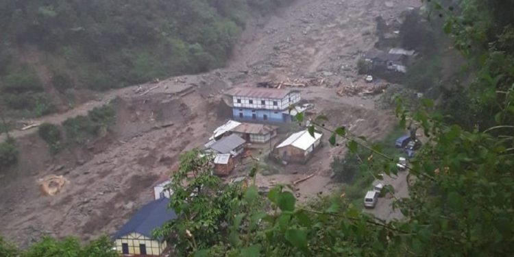
A calamitous cloudburst leading to massive rainfall and flash flood has made disaster in destrying many houses, bridges and roads in Tenga, Arunachal Pradesh.
Several hundred people were reported to be stranded while many others were missing in the flash flood which left a trail of devastation at Kaspi Nala near Nag-Mandir Tenga in West Kameng District of Arunachal Pradesh on Monday evening.
An RCC Bridge between Kaspi and Nagmandir has been washed away by floodwater.
The Army and paramilitary forces along with disaster management authorities have been deployed to rescue the victims.
Meanwhile, the West Kameng district administration has closed the Bhalukpong to Tawang road.
The cloudburst triggered the flash flood on the evening of Monday, damaging over four houses, one boys’ hostel and one hilly restaurant along with several vehicles and motorcycles, according to tourists witnessed.
Earlier in the month of April, Bomdila, the headquarters of West Kameng district experienced cloudburst causing widespread damages to the places in proximity of the township.
The cloudburst was followed by torrential rain and hailstorm which created havoc in the township. According to Chandan Kumar Duarah, a science journalist says the cloudbust and flash flood attributed to massive deforestation, soil cutting in the region and climate change.
The rain lashed the district headquarters for over an hour resulting in chocking of drains and spread of debris all around.
At least 800 people were reported to be stranded while many others were missing in the flash flood which left a trail of devastation at Tenga in West Kameng District of Arunachal Pradesh on Monday evening.
The Army and paramilitary forces along with disaster management authorities have been deployed to rescue the victims.
The cloudburst was followed by torrential rain and hailstorm which created havoc in the township.
The rain lashed the district headquarters for over an hour resulting in chocking of drains and spread of debris all around.
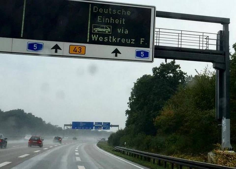
Large parts of western and central Europe sweated under blazing temperatures on June 26, with authorities in one German region imposing temporary speed limits on some stretches of the autobahn, the federal controlled-access higyway system designed for high-speed vehicular traffic, as a precaution against heat damage.
Authorities have warned that temperatures could top 40 degrees Celsius (104 Fahrenheit) in parts of the continent over the coming days as a plume of dry, hot air moves north from Africa.
The transport ministry in Germany’s eastern Saxony-Anhalt state said it has imposed speed limits of 100 kmph or 120 kmph on several short stretches of the highway until further notice. Those stretches usually have no speed limit.
On the evening of June 25, German railway operator Deutsche Bahn called rescue services to Duesseldorf Airport station as a precaution because two trains’ air conditioning systems weren’t working properly, but neither had to be evacuated.
In Paris, authorities banned older cars from the city for the day as a heat wave aggravates the city’s pollution.
Regional authorities estimate these measures affect nearly 60% of vehicles circulating in the Paris region, including many delivery trucks and older cars with higher emissions than newer models. Violators face fines.
Around France, some schools have been closed because of the high temperatures, which are expected to go up to 39 degrees Celsius (102 Fahrenheit) in the Paris area later this week and bake much of the country, from the Pyrenees in the southwest to the German border in the northeast.
Such temperatures are rare in France, where most homes and many buildings do not have air conditioning.
French charities and local officials are providing extra help for the elderly, the homeless and the sick this week, remembering that some 15,000 people, many of them elderly, died in France during a 2003 heat wave.
Prime Minister Edouard Philippe cited the heat wave as evidence of climate destabilization and vowed to step up the government’s fight against climate change.
About half of Spain’s provinces are on alert for high temperatures, which are expected to rise as the weekend approaches.
The northeastern city of Zaragoza was forecast to be the hottest on Wednesday at 39 degrees Celsius, building to 44 degrees Celsius on Saturday, according to the government weather agency AEMET.
In southwestern Europe, however, some people had other reasons to complain during their summer vacation- the Portuguese capital Lisbon, on Europe’s Atlantic coast, awoke cloudy and wet on Wednesday. AP
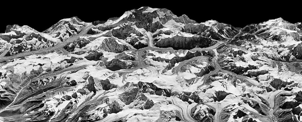
Himalayan glaciers supply meltwater to densely populated catchments in South Asia, and regional observations of glacier change over multiple decades are needed to understand climate drivers and assess resulting impacts on glacier-fed rivers. Here, we quantify changes in ice thickness during the intervals 1975–2000 and 2000–2016 across the Himalayas, using a set of digital elevation models derived from cold war–era spy satellite film and modern stereo satellite imagery. We observe consistent ice loss along the entire 2000-km transect for both intervals and find a doubling of the average loss rate during 2000–2016 [−0.43 ± 0.14 m w.e. year−1 (meters of water equivalent per year)] compared to 1975–2000 (−0.22 ± 0.13 m w.e. year−1). The similar magnitude and acceleration of ice loss across the Himalayas suggests a regionally coherent climate forcing, consistent with atmospheric warming and associated energy fluxes as the dominant drivers of glacier change.
INTRODUCTION
The Intergovernmental Panel on Climate Change 5th Assessment Report estimates that mass loss from glaciers contributed more to sea-level rise than the ice sheets during 1993–2010 (0.86 mm year−1 versus 0.60 mm year−1, respectively), yet uncertainties for the glacier contribution are three times greater (1). Glaciers also contribute locally to water resources in many regions and serve as hydrological buffers vital for ecology, agriculture, and hydropower, particularly in High Mountain Asia (HMA), which includes all mountain ranges surrounding the Tibetan Plateau (2, 3). Shrinking Himalayan glaciers pose challenges to societies and policy-makers regarding issues such as changing glacier melt contributions to seasonal runoff, especially in climatically drier western regions (3), and increasing risk of outburst floods due to expansion of unstable proglacial lakes (4). Yet, substantial gaps in knowledge persist regarding rates of ice loss, hydrological responses, and associated climate drivers in HMA (2).
Mountain glaciers are known to respond dynamically to a variety of drivers on different time scales, with faster response times than the large ice sheets (5, 6). In the Himalayas, in situ studies document significant interannual variability of mass balances (7–9) and relatively slower melt rates on debris-covered glacier tongues over interannual time scales (10, 11). Yet, the overall effects of surface debris cover are uncertain, as many satellite observations suggest similar ice losses relative to clean-ice glaciers over similar or longer periods (12, 13). Because of the complex monsoon climate in the Himalayas, dominant causes of recent glacier changes remain controversial, although atmospheric warming, the albedo effect due to deposition of anthropogenic black carbon (BC) on snow and ice, and precipitation changes have been suggested as important drivers (14–16).
Model projections of future Himalayan ice loss and resulting impacts require robust observations of glacier response to past and ongoing climate change. Recent satellite remote sensing studies have made substantial advances with improved spatial coverage and resolution to quantify ice mass changes during 2000–2016 (12, 17, 18), and former records extending back to the 1970s have been presented for several areas using declassified spy satellite imagery (13, 19–22). These long-term records are especially critical for extracting robust mass balance signals from the noise of interannual variability (6). Many studies also report the highly heterogeneous behavior of glaciers in localized regions, with some glaciers exhibiting faster rates of ice loss during the 21st century (20, 22). Independent analyses document simultaneously increasing atmospheric temperatures at high-elevation stations in HMA (23–26). To robustly quantify the regional sensitivity of these glaciers to climate change, a reliable Himalaya-wide record of ice loss extending back several decades is needed.
Here, we provide an internally consistent dataset of glacier mass change across the Himalayan range over approximately the past 40 years. We use recent advances in digital elevation model (DEM) extraction methods from declassified KH-9 Hexagon film (27) and ASTER stereo imagery to quantify ice loss trends for 650 of the largest glaciers during 1975–2000 and 2000–2016. All aspects of the analysis presented here only use glaciers with data available during both time intervals unless specified otherwise. We investigate glaciers along a 2000-km transect from Spiti Lahaul to Bhutan (75°E to 93°E), which includes glaciers that accumulate snow primarily during winter (western Himalayas) and during the summer monsoon (eastern Himalayas), but excludes complications of surging glaciers in the Karakoram and Kunlun regions where many glaciers appear to be anomalously stable or advancing (2). Our compilation includes glaciers comprising approximately 34% of the total glacierized area in the region, which represents roughly 55% of the total ice volume based on recent ice thickness estimates (15, 28). This diverse dataset adequately captures the statistical distribution of large (>3 km2) glaciers, thus providing the first spatially robust analysis of glacier change spanning four decades in the Himalayas. We extract DEMs from declassified KH-9 Hexagon images for the 650 glaciers, compile a corresponding set of modern ASTER DEMs, fit a robust linear regression through every 30-m pixel of the time series of elevations, sum the resulting elevation changes for each glacier, divide by the corresponding areas, and translate the volume changes to mass using a density conversion factor of 850 ± 60 kg m−3(see Materials and Methods).
RESULTS
Glacier mass changes
Our results indicate that glaciers across the Himalayas experienced significant ice loss over the past 40 years, with the average rate of ice loss twice as rapid in the 21st century compared to the end of the 20th century (Fig. 1). We calculate a regional average geodetic mass balance of −0.43 ± 0.14 m w.e. year−1 (meters of water equivalent per year) during 2000–2016, compared to −0.22 ± 0.13 m w.e. year−1 during 1975–2000 (−0.31 ± 0.13 m w.e. year−1 for the full 1975–2016 interval) (see Materials and Methods). A 30-glacier moving average shows a quasi-consistent trend across the 2000-km longitudinal transect during both time intervals (Fig. 1), and subregions have similar means and distributions of glacier mass balance. Some central catchments deviate somewhat from the Himalaya-wide mean during 2000–2016 (by approximately 0.1 to 0.2 m w.e. year−1) in the Uttarakhand (~79.0° to 80.0°E), the Gandaki catchment (~83.5° to 84.5°E), and the Karnali catchment (~81° to 83°E), which has fewer larger glaciers and relatively incomplete data coverage. Similar to previous in situ and satellite-based studies (18, 29), we observe considerable variation among individual glacier mass balances, with area-weighted SDs of 0.1 and 0.2 m w.e. year−1during each respective interval for the 650 glaciers. This variability most likely reflects different glacier characteristics such as sizes of accumulation zones relative to ablation zones, topographic shading, and amounts of debris cover. Yet, we find that, in our survey (using a rough average of 60 glaciers per 7000-km2 subregion), local variations tend to average out and mean values are similar across most catchments.
Fig. 1Map of glacier locations and geodetic mass balances for the 650 glaciers.Circle sizes are proportional to glacier areas, and colors delineate clean-ice, debris-covered, and lake-terminating categories. Insets indicate ice loss, quantified as geodetic mass balances (m w.e. year−1) plotted for individual glaciers along a longitudinal transect during 1975–2000 and 2000–2016. Both inset plots are horizontally aligned with the map view. Gray error bars are 1σ uncertainty, and the yellow trend is the (area-weighted) moving-window mean, using a window size of 30 glaciers.
Contrasting distributions of glacier mass balances are evident when comparing between time intervals. The 1975–2000 distribution has a negative tail extending to −0.6 m w.e. year−1, while the 2000–2016 distribution is more negative, extending to −1.1 m w.e. year−1 (Fig. 2A). During the more recent interval, glaciers are losing ice twice as fast on average (Fig. 2B), though this varies somewhat between subregions. For example, we find that the average rate of ice loss has increased by a factor of 3 in the Spiti Lahaul region, and by a factor of 1.4 in West Nepal. We also compile altitudinal distributions of ice thickness change for the glaciers and create a Himalaya-wide average thickness change profile versus elevation (Fig. 2, C and D). These distributed thinning profiles are a function of both thinning by mass loss and of dynamic thinning due to ice flow. We find that the 2000–2016 thinning rate (m year−1) profile is considerably steeper, which is likely caused by a combination of faster mass loss and widespread slowing of ice velocities during the 21st century (2, 30).
Fig. 2Comparison of ice losses between 1975–2000 and 2000–2016 for the 650 glaciers.(A) Histograms of individual glacier geodetic mass balances (m w.e. year−1) during 1975–2000 (mean = −0.21, SD = 0.15) and 2000–2016 (mean = −0.41, SD = 0.24). Shaded regions behind the histograms are fitted normal distributions. (B) Result of dividing the modern (2000–2016) mass balances by the historical (1975–2000) mass balances for each glacier, showing the resulting distribution of the mass balance change (ratio) between the two intervals (mean = 2.01, SD = 1.36). In this case, the shaded region is a fitted kernel distribution. (C) Altitudinal distributions of ice thickness change (m year−1) separated into 50-m elevation bins during the two intervals. (D) Normalized altitudinal distributions of ice thickness change. Normalized elevations are defined as (z − z2.5)/(z97.5 − z2.5), where z is elevation and subscripts indicate elevation percentiles. This scales all glaciers by their elevation range (i.e., after scaling, glacier termini = 0 and headwalls = 1), allowing for more consistent comparison of ice thickness changes across glaciers with different elevation ranges. Note the abrupt inflection point in the 2000–2016 profile at ~0.1; this is likely due to retreating glacier termini. Shaded regions in the altitudinal distributions indicate the SEM estimated as σz/nz−−√, where σz is the SD of the thinning rate for each 50-m elevation bin and nz is the number of independent measurements when accounting for spatial autocorrelation (see Materials and Methods).
We multiply geodetic mass balances by the full glacierized area in the Himalayas between 75° and 93° longitude to estimate region-wide ice mass changes of −7.5 ± 2.3 Gt year−1 during 2000–2016, compared to −3.9 ± 2.2 Gt year−1 during 1975–2000 (−5.2 ± 2.2 Gt year−1 during the full 1975–2016 interval). Recent models using Shuttle Radar Topography Mission (SRTM) elevation data for ice thickness inversion estimate the total glacial ice mass in our region of study to be approximately 700 Gt in the year 2000 (see Materials and Methods) (15, 28). If this estimate is accurate, our observed annual mass losses suggest that of the total ice mass present in 1975, about 87% remained in 2000 and 72% remained in 2016.
Comparison of clean-ice, debris-covered, and lake-terminating glaciers
We study mass changes for different glacier types by separating glaciers into clean-ice (<33% area covered by debris), debris-covered (≥33% area covered by debris), and lake-terminating categories based on a Landsat band ratio threshold and manual delineation of proglacial lakes (see Materials and Methods). All three categories have undergone a similar acceleration of ice loss (Table 1), and debris-covered glaciers exhibit similar and often more negative geodetic mass balances compared to clean-ice glaciers over the past 40 years (Fig. 3). Altitudinal distributions indicate slower thinning for lower-elevation regions of debris-covered glaciers (glacier tongues where debris is most concentrated) relative to clean-ice glaciers, but comparatively faster thinning in mid- to upper elevations (Fig. 4). Lake-terminating glaciers concentrated in the eastern Himalayas exhibit the most negative mass balances due to thermal undercutting and calving (31), though they only comprise around 5 to 6% of the estimated total Himalaya-wide mass loss during both intervals.Table 1Himalaya-wide geodetic mass balances (m w.e. year−1).View this table:
Fig. 3Comparison between clean-ice (<33% debris-covered area) and debris-covered (≥33% debris-covered area) glaciers for seven subregions.Circle sizes are proportional to glacier areas, colors delineate clean-ice versus debris-covered categories, and boxplots indicate geodetic mass balance (m w.e. year−1). Box center marks (red lines) are medians; box bottom and top edges indicate the 25th and 75th percentiles, respectively; whiskers indicate q75 + 1.5 ⋅ (q75 − q25) and q25 − 1.5 ⋅ (q75 − q25), where subscripts indicate percentiles and “+” symbols are outliers.Fig. 4Altitudinal distributions of ice thickness change (m year−1) for the 650 glaciers.Glaciers are separated by time interval (top) and category (<33% versus ≥33% debris-covered area) (bottom). (A) Altitudinal distributions of ice thickness change for clean-ice glaciers during 1975–2000 and 2000–2016. The y axes are normalized elevation as in Fig. 2. (B) Same as (A), but for debris-covered glaciers. (C) Altitudinal distributions of ice thickness change during 1975–2000 for clean-ice and debris-covered glaciers. (D) Same as (C), but for 2000–2016. (E) Altitudinal distributions of glacierized area for both glacier categories. Elevational extent of debris cover varies widely between individual glaciers, but is mostly concentrated in lower ablation zones. The clean-ice category includes 478 glaciers and the debris-covered category includes 124 glaciers.
Approximation of required temperature change
As a first approximation of the consistency between observed glacier mass balances and available temperature records, we estimate the energy required to melt the observed ice losses and conservatively estimate the atmospheric temperature change that would supply this energy via longwave radiation to the glaciers, using a simple energy balance approach (Materials and Methods). We propagate significant uncertainties associated with input from global climate reanalysis data, scaling of temperatures from coarse reanalysis grids to specific glacier elevations, and averaging of climate data over the glacierized region. Results suggest that the observed acceleration of ice loss can be explained by an average temperature ranging from 0.4° to 1.4°C warmer during 2000–2016, relative to the 1975–2000 average. This approximately agrees with the magnitude of warming observed by meteorological stations located throughout HMA, which have recorded air temperatures around 1°C warmer on average during 2000–2016, relative to 1975–2000 (Fig. 5). More comprehensive climate observations and models will be essential for further investigation, but these simple energy constraints suggest that the acceleration of mass loss in the Himalayas is consistent with warming temperatures recorded by meteorological stations in the region.
Fig. 5Compilation of previously published instrumental temperature records in HMA.(A) Regional temperature anomalies, relative to the 1980–2009 mean temperatures for each record. The yellow trend (23) from the quality-controlled and homogenized climate datasets LSAT-V1.1 and CGP1.0 recently developed by the China Meteorological Administration (CMA), using approximately 94 meteorological stations located throughout the Hindu Kush Himalayan region. The orange trend (44) is from a similar CMA dataset derived from 81 stations more concentrated on the eastern Tibetan Plateau. The blue trend (24) is from three decades of temperature data from 13 mountain stations located on the southern slopes of the central Himalayas. The black trend is the 5-year moving mean. (B) Temperature anomalies from high-elevation stations at the Chhota Shigri glacier terminus (25); Dingri station in the Everest region (26); average from the Kanzalwan, Drass, and Patseo stations (45); and average of 16 stations above 4000 m elevation on the Tibetan Plateau and eastern Himalayas (46). Here, temperature anomalies are relative to the mean of each record. The gray trend line is the 5-year moving mean. (C) Difference in mean temperature (°C) between the two intervals, i.e., the mean of the 2000–2016 interval relative to the mean of the 1975–2000 interval.
DISCUSSION
Implications for dominant drivers of glacier change in the Himalayas
The parsing of Himalayan glacier energy budgets is not a straightforward task owing to the scarcity of meteorological data, in combination with the complex climate and topography of the region (2). Furthermore, the Himalayas border hot spots of high anthropogenic BC emissions, which may affect glaciers by direct heating of the atmosphere and decreasing albedo of ice and snow after deposition (14). While improved analyses combining observations and high-resolution atmospheric and glacier energy balance models will be required to quantify these effects, the pattern of ice loss we observe has important implications regarding dominant climate influences on Himalayan glacier mass balances. Our results suggest that any drivers of glacier change must explain the region-wide consistency, the doubling of the average rate of ice loss in the 21st century compared to 1975–2000, and the observation that clean-ice, debris-covered, and lake-terminating glaciers have all experienced a similar acceleration of mass loss.
Some studies have suggested a weakening of the summer monsoon and reduced precipitation as primary reasons for negative glacier mass balances, particularly in the Everest region (16). While decreasing accumulation rates may account for a significant portion of the mass balance signal for some glaciers, an extreme Himalaya-wide decrease in precipitation would be required to explain the extensive ice losses we observe, especially given that monsoon-dominated glaciers with high accumulation rates are known to be much more sensitive to temperature than accumulation changes (5, 32). Regional studies of precipitation trends in the Himalayas do not suggest a widespread decrease in precipitation over the past four decades (Supplementary Materials). A uniform BC albedo forcing across the Himalayas is another possible explanation, although BC concentrations measured in snow and ice in the Himalayas have been found to be spatially heterogeneous (14, 33), and high-resolution atmospheric models also show large spatial variability of deposited BC originating from localized emissions in regions of complex terrain (14, 34). Future analyses focused on quantifying the spatial patterns of BC deposition will reveal further insights, yet given the rather homogeneous pattern of mass loss we observe across the 2000-km Himalayan transect, a strong, spatially heterogeneous mechanism seems improbable as a dominant driver of glacier ice loss in the region.
Debris-covered glaciers
Similar thinning rates of debris-covered (thermally insulated) glaciers relative to clean-ice glaciers have been observed by previous studies and have been not only ascribed to surface melt ponds and associated ice cliffs acting as localized hot spots to concentrate melting but also attributed to declining ice flux causing dynamic thinning and stagnation of debris-covered glacier tongues (2). While we cannot yet directly deconvolve relative contributions from these processes, we find that average thinning rates for debris-covered glaciers are slower than clean-ice glaciers at low elevations (glacier tongues where debris is most concentrated), which agrees with reduced melt rates from field studies. In turn, debris-covered glaciers tend to have comparatively faster thinning at mid-range elevations, where debris cover is sparser and also where the majority of total glacierized area resides (Fig. 4). Models of debris-covered glacier processes suggest that this pattern of thinning may cause a reduction in down-glacier surface gradient, which, in turn, reduces driving stress and ice flux and explains why debris-covered ablation zones become stagnant (35). We also find that clean-ice glaciers exhibit a much more pronounced steepening of the thinning profile over time, compared to debris-covered glaciers. It may be that both glacier types experience a uniform thinning phase followed by a changing terminus flux and retreat phase, but the clean-ice glaciers are in a later phase of response to recent climate change (36).
Comparison with previous studies in the Himalayas
To compare our results with previous remote sensing studies that derive mass changes from various sensors (including Hexagon, SRTM, SPOT5, ICESat, and ASTER), we restrict our results to the approximate geographical regions covered by each corresponding study (12, 13, 17–22) and then compute area-weighted average geodetic mass balances. In addition, we compare individual glacier mass balances for the Everest and Langtang Himal regions, where mass changes were previously estimated using declassified Corona and Hexagon imagery (13, 19, 20). Despite factors such as variable spatial resolutions, distinct void-filling methods, heterogeneous spatial and temporal coverages, and different definitions of glacier boundaries, we find that our average mass balances generally agree with previous analyses and overlap within uncertainties (table S1). However, because of the significant variability of individual glacier mass changes within subregions, our results also highlight the importance of sampling a large number of glaciers to obtain a robust average trend for any given area.
Comparison with benchmark mid-latitude glaciers and global average
To gain perspective on mass losses from these low-latitude glaciers in the monsoonal Himalayas, we compare our results with benchmark mid-latitude glaciers in the European Alps, as well as with a global average mass balance trend (fig. S1) (37). The Alps contain the most detailed long-term glaciological and high-elevation meteorological records on Earth, and the climatic sensitivity and behavior of these European glaciers are well understood compared to glaciers in HMA. Air temperatures in the Alps show an abrupt warming trend beginning in the mid-1980s, and Alpine mass balance records display a concurrent acceleration of ice loss, with a continual strongly negative mass balance after that time. Himalayan weather station data indicate a more gradual warming trend, with the strongest warming beginning in the mid-1990s (fig. S1, A and B). We find that mass balance in the Himalayas is less negative compared to the Alps and the global average, despite close proximity to a known hot spot of increasing BC emissions with rapid growth and accompanying combustion of fossil fuels and biomass in South Asia (38). The concurrent acceleration of ice loss observed in both the Himalayas and Europe over the past 40 years coincides with a distinct warming trend beginning in the latter part of the 20th century, followed by the consistently warmest temperatures through the 21st century in both regions.
Conclusion
Our analysis robustly quantifies four decades of ice loss for 650 of the largest glaciers across a 2000-km transect in the Himalayas. We find similar mass loss rates across subregions and a doubling of the average rate of loss during 2000–2016 relative to the 1975–2000 interval. This is consistent with the available multidecade weather station records scattered throughout HMA, which indicate quasi-steady mean annual air temperatures through the 1960s to the 1980s with a prominent warming trend beginning in the mid-1990s and continuing into the 21st century (23–26). We suggest that degree-day and energy balance models focused on accurately quantifying glacier responses to air temperature changes (including energy fluxes and associated feedbacks) will provide the most robust estimates of glacier response to future climate scenarios in the Himalayas.
MATERIALS AND METHODS
Hexagon
U.S. intelligence agencies used KH-9 Hexagon military satellites for reconnaissance from 1973 to 1980. A telescopic camera system acquired thousands of photographs worldwide, after which film recovery capsules were ejected from the satellites and parachuted back to Earth over the Pacific Ocean. With a ground resolution ranging from 6 to 9 m, single scenes from the mapping camera cover an area of approximately 30,000 km2 with overlap of 55 to 70%, allowing for stereo photogrammetric processing of large regions. Images were scanned by the U.S. Geological Survey (USGS) at a resolution of 7 μm and downloaded via the Earth Explorer user interface (earthexplorer.usgs.gov). Digital elevation models were extracted using the Hexagon Imagery Automated Pipeline methodology, which is coded in MATLAB and uses the OpenCV library for Oriented FAST and Rotated BRIEF (ORB) feature matching, uncalibrated stereo rectification, and semiglobal block matching algorithms (27). The majority of the KH-9 images here were acquired within a 3-year interval (1973–1976), and we processed a total of 42 images to provide sufficient spatial coverage (fig. S2).
ASTER
The ASTER instrument was launched as part of a cooperative effort between NASA and Japan’s Ministry of Economy, Trade and Industry in 1999. Its nadir and backward-viewing telescopes provide stereoscopic capability at 15-m ground resolution, and a single DEM covers approximately 3600 km2. Approximately 26,000 ASTER DEMs were downloaded via the METI AIST Data Archive System (MADAS) satellite data retrieval system (gbank.gsj.jp/madas), a portal maintained by the Japanese National Institute of Advanced Industrial Science and Technology and the Geological Survey of Japan. To use all cloud-free pixels (including images with a high percentage of cloud cover), no cloud selection criteria were applied when downloading the images. We used the Data1.l3a.demzs geotiff product, which has a spatial resolution of 30 m. After downloading, the DEMs were subjected to a cleanup process: For a given scene, any saturated pixels (i.e., equal to 0 or 255) in the nadir band 3 (0.76 to 0.86 μm) image were masked in the DEM. Next, the SRTM dataset was used to remove any DEM values with an absolute elevation difference larger than 150 m (relative to SRTM), which effectively eliminated the majority of errors caused by clouds. While more sophisticated cloud masking procedures are possible, the ASTER shortwave infrared detectors failed in April 2008, making cloud detection after this time impossible using standard methods. We examined existing cloud masks derived using Moderate Resolution Imaging Spectroradiometer images as another option (tonolab.cis.ibaraki.ac.jp/ASTER/cloud/). However, these are not optimized for snow-covered regions and often misclassify glacier pixels as clouds. Instead, our large collection of multitemporal ASTER scenes, the SRTM difference threshold, and our robust linear trend fitting algorithm [see description of Random Sample Consensus (RANSAC) in the “Trend fitting of multitemporal DEM stacks” section] effectively excluded any remaining erroneous cloud elevations after the initial threshold. As a final step, all ASTER DEMs were coregistered to the SRTM using a standard elevation–aspect optimization procedure (39). We did not apply fifth-order polynomial correction procedures to the ASTER DEMs for satellite “jitter” effects and curvature bias as done in some previous studies (18). We found that while these types of corrections may reduce the overall average elevation error in a scene, the polynomial fitting can be unwieldy and may introduce unwanted localized biases. By stacking many ASTER DEMs (with 20.5 being the average number of observations per pixel stack during the ASTER trend fitting, see fig. S3E) and using a robust fitting procedure, we found that biases do not correlate across overlapping scenes, and thus tend to cancel out one another. Furthermore, the elevation change results from this portion of our study overlap within uncertainties with Brun et al. (18) (Supplementary Materials) who did perform polynomial corrections. This suggests that for a large-scale regional study using a high number of overlapping ASTER scenes, the satellite jitter and curvature bias corrections have a relatively minimal impact on the final results.
Glacier polygons
To delineate glaciers during all portions of the analysis, we used manually refined versions of the Randolph Glacier Inventory (RGI 5.0) (40). Starting with the original RGI dataset, we edited the glacier polygons to reflect glacier areas during 1975, 2000, and 2016. For the 1975 edit, we used a combination of Hexagon imagery, the Global Land Survey (GLS) Landsat Multispectral Scanner mosaic (GLS1975), and glacier thickness change maps derived from differencing the Hexagon and modern ASTER DEMs, which are particularly useful for debris-covered glacier termini that often have spectral characteristics indistinguishable from surrounding terrain. Debris-covered areas for each glacier were delineated using a Landsat DN TM4/TM5 band ratio with a threshold of 2.0, and glaciers with ≥33% debris cover were assigned to the debris-covered category. For the 2000 edit, we used the GLS2000 Landsat Enhanced Thematic Mapper Plus mosaic, along with glacier thickness change maps derived from differencing ASTER DEMs. For the 2016 edit, we used a custom mosaic of Landsat 8 imagery with acquisition dates spanning 2014–2016. The individually edited glacier polygons were used for all ice volume change and geodetic mass balance computations. The polygons were also used during alignment of the DEMs, where the shapefiles were converted to raster masks with a dilation (morphological operation) of 250 m on the binary rasters. This effectively excluded unstable terrain surrounding the glaciers during the DEM alignment process, such as steep avalanching slopes and unstable moraines.
Trend fitting of multitemporal DEM stacks
Glacier polygons were processed individually—all DEMs from a given time interval (1975–2000 or 2000–2016) that overlap a polygon were selected and resampled to the same 30-m resolution using linear interpolation. The overlapping DEMs were sampled with a 25% extension around each glacier to include nearby stable terrain for alignment and uncertainty analysis (fig. S4). After ensuring that there is no vertical bias, the aligned DEMs were sorted in temporal order as a three-dimensional matrix, and linear trends were fit to every pixel “stack” (i.e., along the third dimension of the matrix) using the RANSAC method. During each RANSAC iteration, a random set of two elevation pixels per stack were selected. A linear trend was fit to these two values, and then all remaining elevation pixels were compared to the trend. Any elevation pixels within 15 m of the trend line were marked as inliers. This process was repeated for 100 iterations, and the iteration with the greatest number of inliers was selected. A final linear fit was performed using all inliers from the best iteration, and this trend was used for each pixel stack’s thickness change estimate. The thickness change maps were subjected to outlier removal using thresholds for maximum slope, maximum thickness change, minimum count per pixel stack, minimum timespan per pixel stack, maximum SD of inlier elevations per pixel stack, and maximum gradient of the thickness change map (fig. S3). In addition, the thickness change pixels were separated into 50-m elevation bins, and pixels falling outside the 2 to 98% quantile range were excluded. Any bins with less than 100 pixels were removed and then interpolated using the two adjacent bins. Before computing ice volume change for the glaciers, the final thickness change maps were visually inspected, any remaining erroneous pixels (which occurred almost exclusively in low-contrast, snow-covered accumulation zones) were manually masked, and a 5 × 5 pixel median filter was applied. We did not attempt to perform seasonality corrections, as no seasonal snowfall records are available and because nearly all the Hexagon DEMs were acquired during winter, thus minimizing any seasonality offsets between regions. For the 1975–2000 interval, we used the Hexagon DEMs and sampled ASTER thickness change trends at the start of the year 2000. For regions with multiple overlapping Hexagon DEMs, we used the same RANSAC method. During the 1975–2000 interval, only two DEMs were available for most glaciers. In these cases, the RANSAC iterations were unnecessary, and we simply differenced the two available DEMs. We did not use SRTM for any thickness change estimates; thus, no correction for radar penetration was necessary.
Mass changes
To compute (mean annual) ice volume changes for individual glaciers, all thickness change pixels falling within a glacier polygon were transformed to an appropriate projected WGS84 UTM coordinate system (zones 43 to 46, depending on longitude of the glacier). Pixel values (m year−1) were then multiplied by their corresponding areas (pixel width × pixel height) and summed together. The resulting ice volume change was then divided by the average glacier area to obtain a glacier thickness change. We used the average of the initial and final glacier areas for a given time interval and excluded slopes greater than 45° to remove any cliffs and nunataks. Last, the glacier thickness change was multiplied by an average ice-firn density (41) of 850 kg m−3 and then divided by the density of water (1000 kg m−3) to compute glacier geodetic mass balance in m w.e. year−1. Because of cloud cover, shadows, and low radiometric contrast, some glacier accumulation zones had gaps in the DEMs and resulting thickness change maps. This is particularly evident in the Hexagon DEMs for the Spiti Lahaul region owing to extensive cloud cover. To fill these gaps, we tested two different void-filling methods for comparison. In the first method, we defined a circular search area with a radius of 50 km around the center of a given glacier. All thickness change pixels from glaciers in this surrounding area were binned (into 50-m elevation bins, and following the same outlier-removal procedure given in the preceding section), and any missing data in the glacier were set to this “regional bin” mean value at the corresponding elevation. In the second method, we filled data gaps using an interpolation procedure, where voids in an individual glacier were linearly interpolated using bin values at upper and lower elevations relative to the missing data (those belonging to the same glacier), and assumed zero change at the highest elevation bin (headwall). Both methods yielded similar results (table S1). In addition, no obvious trends were apparent when geodetic mass balance was plotted versus percent data coverage or glacier size (fig. S5). While smaller glaciers exhibited more scatter, the average mass balance was similar for all glacier sizes. These observations indicate that our representative sample of glaciers, while biased toward larger glaciers, adequately captures the statistical distribution of glacier mass balances in the Himalayas.
To calculate regional geodetic mass balances, we separated glaciers into four subregions (Spiti Lahaul, West Nepal, East Nepal, and Bhutan) as defined by Brun et al. (18). We then calculated the average mass balance for each of these four subregions, weighted by individual glacier areas. Last, we calculated a final average mass balance for the Himalayas, weighted by the total glacierized area (from the RGI 5.0 database) in each of the four subregions, between 75° to 93° longitude. Because of the relatively homogeneous mass balance distribution, we found that this approach resulted in similar values (well within the uncertainties) compared to simply calculating the area-weighted average mass balance of the 650 measured glaciers. To obtain the total mass changes in Gt year−1, we multiplied each subregion mass balance by its total glacierized area and then summed the results from all subregions to get Himalaya-wide totals of −3.9 Gt year−1 for 1975–2000 and −7.5 Gt year−1 for 2000–2016. To calculate contributions to sea-level rise, we used a global ocean surface area of 361.9 × 10⁶ km2 (fig. S4G).
To estimate the total ice mass present in our region of study, we used ice thickness estimates from Kraaijenbrink et al. (15), who used the Glacier bed Topography version 2 model to invert for ice thickness (28) with input from the SRTM DEM (acquired in February of 2000). The ice thickness estimates from (15) did not include glaciers smaller than 0.4 km2, and to estimate the additional mass contribution from these smallest glaciers (along with any other glaciers that are missing thickness estimates), we fit a second-order polynomial to the logarithm of glacier volumes versus the logarithm of glacier areas and evaluated this fit equation for any glaciers without volume data (fig. S6). We then converted glacier volume to mass using a density value of 850 kg m−3. Over our region of study, the ice volumes from the thickness data amounted to 649 Gt, with an additional contribution of 35 Gt from the fitting procedure, for a total of 684 Gt.
Uncertainty assessment
We quantified statistical uncertainty for individual glaciers using an iterative random sampling approach. For a given glacier, the SD of elevation changes from the surrounding stable terrain (σz) was first calculated. For any missing thickness change pixels within the glacier polygon, we also included an extrapolation uncertainty σe. This accounts for additional error in regions with incomplete data, i.e., those glacier regions filled by extrapolating thickness changes from surrounding glaciers, or linear interpolation assuming zero change at the headwall, as described in the previous section. We found that in the Himalaya-wide altitudinal distributions, the maximum SD of thickness change in any 50-m elevation bin above 5000 m is 0.56 m year−1. Nearly all regions with incomplete data coverage are above this elevation, resulting from poor radiometric contrast for snow-covered glacier accumulation zones. We thus conservatively set σe equal to 0.6 m year−1. We then combined both sources of error to get σp for every individual thickness change pixelσp=σ2z+σ2e−−−−−−√(1)
To account for spatial autocorrelation, we started with a normally distributed random error field (with a mean of 0 and an SD of 1) the same size as the thickness change map and then filtered it using an n-by-n moving window average to add spatial correlation, where n is defined as the spatial correlation range divided by the spatial resolution of the thickness change map. We used 500 m for the spatial correlation range, which is a conservative value based on semivariogram analysis in mountainous regions from previous studies (18, 21, 42). The resulting artificial error field En (now with spatial correlation) is scaled by the σp values and added to the thickness change map ΔH as follows, where (x, y) are pixel coordinatesΔHE(x,y)=ΔH(x,y)+En(x,y)⋅σp(x,y)σn(2)
If thickness change data exist at a given pixel location (x, y) on the glacier, σn is the SD of the set of all En values where data exist (i.e., where σe is equal to zero). Conversely, if thickness change data do not exist at a given pixel location (x, y) on the glacier, σn is the SD of the set of all En values where data do not exist (i.e., where σe is equal to 0.6 m year−1). In this way, the second term of Eq. 2 assigns larger uncertainties to regions with incomplete data. Last, all glacier thickness change pixels in ΔHE were summed together to compute a volume change with the introduced error. This procedure was repeated for 100 iterations, and the volume change uncertainty σΔV was computed as the SD of the resulting distribution (fig. S4). For region-wide volume change estimates, we conservatively assumed total correlation between glaciers and computed region-wide uncertainty as follows, where g is the total number of glaciers (~17,400)σΔV region=∑1gσΔV(3)
For glaciers where thickness change data are not available, a measure of uncertainty is still required to factor into the final regional uncertainty estimate. For these glaciers, we estimated σΔVas (42)σΔV=σ2z region⋅Acor5⋅A−−−−−−−−−−−√(4)Acor=π⋅L2(5)
In this case, σz region is the region-wide SD of elevation change over stable terrain (0.42 m year−1) (fig. S7), Acor is the correlation area, L is the correlation range (500 m), and A is the glacier area. Last, all σΔV and σΔV regjon estimates were combined with an area uncertainty (43) of 10% and a density uncertainty (41) of 60 kg m−3 using standard uncorrelated error propagation.
Sensitivity of region-wide glacier mass change estimates
We further tested the sensitivity of our region-wide estimates to potential biases, including (i) the exclusion of small glaciers, (ii) incomplete data coverage for many glacier accumulation zones during 1975–2000, and (iii) void-filling technique. First, we note that our geodetic mass balance analysis only includes glaciers larger than 3 km2. This is because mass balance uncertainties increase with decreasing glacier size, and we find that uncertainties often exceed the magnitude of mass changes for glaciers smaller than ~3 km2. To test whether the neglected small glaciers appreciably affect the result, we also computed mass balances using all available glaciers (i.e., all glaciers with ≥33% data coverage, including those smaller than 3 km2). We find that including the full set of smaller glaciers changes the region-wide geodetic mass balance estimates by a maximum of 0.04 m w.e. year−1 (fig. S4G). Next, we note that the Hexagon DEMs in particular have poor data coverage over glacier accumulation zones (figs. S8 and S9). However, the vast majority of thinning occurs in glacier ablation zones, and the amount of thinning decreases with elevation in a quasi-linear fashion, especially in mid- to upper regions of the glaciers where data gaps are most common. Thus, we hypothesize that we can extrapolate and interpolate with reasonable confidence over accumulation areas. To test the robustness of this assumption, we used the 2000–2016 glacier change data. The ASTER data over this interval have superior radiometric contrast and adequately capture elevation change trends for most accumulation zones. We first set all 2000–2016 thickness change pixels to be empty where the 1975–2000 data are missing to simulate the same data gaps over accumulation zones as in the 1975–2000 data. We then performed the same geodetic mass balance calculations and found that the region-wide geodetic mass balance only changes by 0.01 m w.e. year−1 (fig. S4G, comparing test 3 to test 1). Last, we performed two separate void-filling methods for all tests (see the “Mass changes” section for descriptions of void-filling methods) and observed a maximum change in geodetic mass balance of 0.04 m w.e. year−1. Overall, the relatively small impact of each test suggests that our results are robust to the exclusion of small glaciers, incomplete data coverage over glacier accumulation zones, and void-filling technique.
Fig. S1. Comparison of Himalayan temperature trends and regional mass balance with benchmark mid-latitude glaciers and a global average trend.
Fig. S2. Coverage of glacierized area in the Himalayas.
Fig. S3. Trend fit examples for two large glaciers using ASTER DEMs during 2000–2016, histograms of ASTER pixel counts and timespans per stack (glacier averages), and outlier thresholds.
Fig. S4. Illustration of uncertainty estimation procedure for a single iteration/glacier and Himalaya-wide sensitivity tests.
Fig. S5. Geodetic mass balances during 1975–2000 and 2000–2016 plotted against various parameters.
Fig. S6. Log-log plot of glacier volumes versus areas used to estimate the total ice mass present in our region of study.
Fig. S7. Analysis of elevation change for nonglacier pixels (stable terrain) during both intervals.
Fig. S8. Thickness change maps used in the analysis.
Fig. S9. Thickness change maps for the three remaining Himalayan regions.
Table S1. Geodetic mass balance comparisons with prior studies.
This is an open-access article distributed under the terms of the Creative Commons Attribution-NonCommercial license, which permits use, distribution, and reproduction in any medium, so long as the resultant use is not for commercial advantage and provided the original work is properly cited.
MIKE MCRAE Just under half a century ago a system of satellites codenamed Hexagon was circling the globe and snapping high-resolution shots of the changing landscape… not to mention a Russian airfield or two.
With the Cold War long melted, those images were declassified back in 2002, providing rich pickings for all kinds of research. Now scientists have used these pictures to present a startling new perspective on the Himalaya’s vanishing glaciers.
A team of US researchers from Columbia University and the University of Utah have made detailed measurements on changes to the thickness of ice in the Himalayas between two time periods; from 1975 to 2000, and then 2000 to 2016.
In some ways, what they found might not come as a great shock, if you’ve been paying attention to the climate crisis.
“It looks just like what we would expect if warming were the dominant driver of ice loss,” says the study’s lead author Joshua Maurer from Columbia University’s Lamont-Doherty Earth Observatory.
The team stitched together galleries of images of the Himalayas taken by the Keyhole-9 ‘Hexagon’ photographic reconnaissance satellites, ending up with an overview of some 650 glaciers spanning the famous mountain range.
They then developed a process to turn the 3D map into a form that provided information on elevations.
By comparing the results with modern stereo satellite imagery from NASA’s Advanced Spaceborne Thermal Emission and Reflection Radiometer (ASTER) program, Maurer and his team could calculate annual changes to ice coverage.
Since the turn of the millennium, glaciers have thinned by an average of just under half a metre (roughly 1.5 feet) per year. Over the preceding decades, that loss was half; closer to 22 centimetres, or just under 10 inches.
That’s averaged out as well. While some glaciers at higher elevations are holding steady, there are rivers of ice closer to sea level that are losing on average 5 metres (16 feet) a year.
Of course, glaciers can thin out over time for a number of reasons. Lower precipitation, for example, or fine particulates from pollution increasing localised warming by darkening the ice and absorbing sunlight.
These factors can almost certainly contribute to the melting of large patches here and there, but the sheer scale of the change implies a more global effect.
To test their suspicions, the team also compiled data on temperatures taken by ground stations and compared these with rates of melting across the map.
Sure enough, both sets of figures lined up neatly enough to reveal that our warming planet can certainly account for the ice loss.
“This is the clearest picture yet of how fast Himalayan glaciers are melting over this time interval, and why,” says Maurer.
Further west, mountain ranges such as the Alps have attracted attention for accelerated melting of their icy peaks in the 1980s.
While it took a little longer to come up to speed, it’s now clear the Himalayas are rocketing ahead. Given the area they cover and their position, we can expect the melting of their glaciers to be a catastrophe of immense proportions.
Seasonal snowmelts contribute significant quantities of water to major river systems such as the Indus, where hundreds of millions rely on its flow and volume for drinking water, farming, and hydroelectricity.
Increased melting might temporarily be a boon, but in the long term, millions of people will face an increasing risk of water crisis.
Tragically, pooling meltwater is putting communities at greater risk of cataclysmic flooding as elevated lakes burst at the seams, sending walls of water crashing downhill.
In the 1970s, US authorities launched the Hexagon system of spy satellites partially in hope of having advanced warning of a building global threat.
Thankfully, that particular type of threat never eventuated. But now, nearly 50 years later, the same library of pictures has given us strong evidence of a much more serious threat. This time, it’s real.
The Odisha government has decided to revive the traditional practice of planting palm trees to deal with the issue of deaths caused by lightning every year. Approximately 500 lives are lost annually due to lightning in the State. Palm trees, being the tallest ones, act as a good conductor when lightning strikes.
Palm tree plantations will come up along the forest boundaries on National and State Highways and in common land in coastal villages. The State Forest and Environment Department has issued instructions to all regional conservators of forests and divisional forest officers in this regard.
Traditional practice
“Earlier, planting palm trees was a traditional practice in villages, but this has now been discontinued due to urbanisation and development. The tree has a wide range of uses — its fruits are eaten, the stem is valuable as wood, and baskets and mats are woven with the leaves. It is also learnt to be helpful as a bulwark against lightning casualties,” said D. Swain, principal chief conservator of forests.
“Lightning usually hits the tallest object first. The palm tree being the tallest among other trees in its surroundings works as a lightning conductor, decreasing deaths by lightning,” said Mr. Swain. Palm trees also protect coastal areas from storms and cyclones, while its roots protect embankments from soil erosion.
According to Bishnupada Sethi, managing director, Odisha State Disaster Management Authority (OSDMA), as many as 1,256 lightning deaths took place in the State in the last three years, most of them (about 85%) in the May-September period. Lightning deaths account for about 27% of the total number of ‘disaster deaths’.
The OSDMA has taken up a massive awareness drive, educating people on how to react during a thunderstorm.
The neighbouring Bangladesh, which also sees many deaths every year due to lightning strikes, has announced a similar programme to plant one million palm trees.
The maximum lightning incidents are attributable to climate change in the entire Indian subcontinent, central Bangladesh and Northeast India in the Brahmaputra Basin. The Indian Meteorological Department (IMD) has recently issued a weather forecast for Assam and Meghalaya that, thunderstorm accompanied by lightning mostly occurred on March 5 and 6, 2019. The Weather Channels also predicted rain or snow accumulation in the east and Northeast India till Thursday evening. The fury of nature has been left many parts of Northeastern region of India in tatters. Incessant rainfall in most areas of Garo Hills in Meghalaya has left trails of destruction with houses, schools, and trees strewn in the aftermath of this horrific weather. While some districts of Assam and West Meghalaya have been partially affected, the districts of North and East Garo Hills in the state of Meghalaya were worst hit. Most lightning deaths and injuries occur when people are caught outdoors in the summer months during the afternoon and evening. Deaths from lightning strikes is now one of the most discussed subjects in the country. Most of the victims are the lone breadwinners in their families. The maximum lightning incidents in the entire Indian subcontinent occur in central Bangladesh and the states of Meghalaya, West Bengal, and Assam before the monsoon season (March-May) with 40 lightning strikes per square kilometer. The data of the National Crime Records Bureau (NCRB) says lightning kills more people in India than any other natural calamity. According to a 2014 NCRB report, out of 20,201 accidental deaths attributable to natural causes, 12.8 percent were due to a lightning strike. The 2014 report published by Indian Meteorological Department (IMD) reported the period between March 15 to June 15, 2014, Assam experienced the highest number of thunderstorms followed by Arunachal Pradesh in March, Meghalaya in April and Tripura in May and June. During the entire period, the frequency was the highest during the night (30 percent) followed by evening (21 percent). In Bangladesh the lighting strike death toll is unbelievable. On last May 2018, 29 people died from lightning in 12 districts in 24 hours, and almost all of them are farm workers. Earlier, at least 12 people died in March, and 58 people died in April 2018 in parts of Bangladesh, according to government data. In the last two days of April last year, as many as 33 people were killed as storms swept across the country, said Disaster Management Minister Mofazzal Hossain Chowdhury Maya. The number of deaths was 160 in 2015, 170 in 2014, 185 in 2013, 201 in 2012 and 179 in 2011. Lightning poses a significant threat as an increasing number of people are losing life due to the natural disaster every year, experts say. Scores of people die every year after being struck by lightning during the rainy season in Bangladesh, which runs from April to October. The officials say the numbers are exceptionally high this year. Every day 10 to 12 people are dying from a lightning strike. Authorities declared lightning strike to be a natural disaster after 82 people were killed in a single day in May 2016. Independent monitors estimated that some 349 Bangladeshis died from lightning that year. In Bangladesh, the thunderstorm usually occurs from March to May, but sometimes it takes place until October or November. Owing to a sudden change in weather, heavy rain and strong gales that originate in the Bay of Bengal, end up causing lightning strikes and loss of lives in the Bangladesh and Indian Northeast. According to a new study, the above numbers can dramatically increase if the current rate of global warming continues. As reported in the journal of Science, it is expected to see a 12% increase in lightning activity for every 1 degree centigrade (1.8 degrees F) of warming, meaning the U.S. could experience a 50% increase in strikes by the turn of the century. In affected regions, people suffer “light dumb” disorder and significantly suffer a moderate headache. Many people succumb to severe heart failures. In Bangladesh, there are records of people suffering light heart failure and neural damage. Moreover, some suffered from moderate skin irritation and headache and some with severe heart failure and neural damage disease. Is climate change responsible? Lightning emerged as a new natural disaster in the Northeast Indian states and the Bay of Bengal area. The Brahmaputra flows through the region and ends at the confluence of the Bay of Bengal. This entire region is prone to lightning because of its complex topography, killing many people every year. Studies have shown thunderstorms are very frequent during the pre-monsoon season over northeastern India and Bangladesh. They are especially distinctive by their nature and severity compared to other storms, which occur over some other regions or during some different seasons. Lightning, as well as thunder and storms, are hazardous. Mostly they appear together. Anyone can strike and kill people, and also trigger potentially devastating wildfires. Studies exploring how lightning could change with rising temperatures are few and far between, and those that have been conducted have produced wildly different results. For the current study, scientists from the University of California, Berkeley, started by examining the relationship between atmospheric variables and lightning rates. They hypothesized that two factors– precipitation (the amount of water that hits the ground) and the amount of energy available to make atmospheric air rise– could predict lightning flash rate. These variables can both be used as measures of storm convection (the vertical movement of air), a process that is known to generate lightning which requires two key ingredients: water in all three states (liquid, solid and gas) and quickly rising clouds to keep the ice suspended. Next, they applied these variables to 11 different climate models, all of which assume that there will be no significant drops in greenhouse gas emissions, and found that lightning would likely increase by around 12% per 1 degree Centigrade. Since it is predicted that temperatures will be around 4°C higher at the end of the century, this means there could be a 50% increase in strikes in the US by 2100. This could potentially mean more human injuries and more wildfires since around half of all fires are started by lightning. The entire Bay of Bengal, a part of Assam, Meghalaya and West Bengal are prone to lightning because of the complex topography. Studies have shown thunderstorms are very frequent during the pre-monsoon season in northeastern India and Bangladesh. They are especially distinctive by their nature and severity compared to other storms, which occur over some other regions or during some different seasons. Presently most scientists believe, with the increase in global temperature, the intensity of thunderstorms and lightning will magnify in intensity. The thundercloud formation because of excess heat over Bangladesh is resulting in thunderbolts and lightning, particularly in the regions where water bodies are high, such as Haor areas. The wind convergence occurs in active convection which is the upward movement of warm and moist air. The subsequent instability results in widespread precipitation with chances of thunderstorms. According to Prof Rashid, the temperature rose in April in Bangladesh, which has caused water to vaporize and leads to rain, clouds, and lightning. Bangladesh is witnessing increasing numbers of casualties from lightning, a natural disaster, for the last few days, mainly because of the rise in temperature that is leading to the formation of upper air circulation in the geographical region, experts say. The geographical location of Bangladesh with the Himalayas in the north, the Bay of Bengal in the south, as well as the Indian Ocean and Arabian sea in the proximity, it is adding to the creation of thunderstorms in the region. It is to be noted that Northeast India, together with Bangladesh, is one of the most thunderstorm-prone regions in the world, substantiated by Tetsuya Fujita of the University of Chicago in 1973. Fujita along with Allen Pearson had developed the Fujita Pearson Scale for measuring the damage caused by tornadoes. Of all the severe thunderstorm events in the Northeast region during the 55 years of the study period, about 30 percent of the incidents resulted from storms (nor’easters), with hail and lightning accounting for 18 percent and 10 percent of all recorded events. While severe thunderstorms can develop at any time of the year, over half of the severe thunderstorm events occurred in the region during March, April, and May, peaking during the latter months. A secondary peak in severe thunderstorm events occurs in September and is likely due to the impact of tropical cyclones or their remnants flowing from the warm waters of the Bay of Bengal. The data compiled by the ICRC on the occurrence of severe thunderstorm incidents show that they are first seen on an isolated day in February under the influence of a western disturbance, and it becomes a familiar feature during the hot afternoons of April to May to early morning hours of the next days. Summer monsoon season with 60 percent incidents is the most favored time of the year for the occurrence of lightning strikes in Assam, followed by pre-monsoon season with 32 percent of the incidents. During the 55-year study period, it was reported that 22 people died on an average per year from severe thunderstorm hazards in Northeast India. More than 60 percent of these death cases were due to lightning. In general, severe thunderstorm impacts like loss of life and injury, loss of livelihood and damage to infrastructure are significantly more on impoverished and vulnerable rural population in the western part of Assam. The total climatology of lightning activity showed that the region of the west of Assam experiences higher lightning activity. Another study published in the International Journal of Climatology in September 2015, which was carried out by Hupesh Choudhury, Partha Roy, Sarbeswar Kalita and Sanjay Sharma states that during the pre-monsoon season, the frequency of lightning is quite significant in the Northeast due to the interaction of moisture-laden wind with the complex topography of the region. The Meghalaya plateau and foothills of Patkai hill range, in particular, experience severe lightning. Iqbal R Tinmaker and Kaushar Ali of the Indian Institute of Tropical Meteorology finds almost the same result attributed to space-time variation of lightning activity over Northeast India. They revealed lightning flash rate density is the maximum over the west of northeast India. The study, published in Meteorologische Zeitschrift in April 2012, said this high flash rate density is attributable to the topography and the geography of the region, along with the moisture availability. The 2014 report published by Indian Meteorological Department (IMD) said the highest number of thunderstorms in each month of the storm period (March 15 to June 15, 2014) was recorded in Assam, followed by Arunachal Pradesh in March, Meghalaya in April and Tripura in May and June. During the entire period, the frequency was highest during the night (30 percent) followed by evening (21 percent). Apart from agriculture fishing is at risk condition at the time of thunderstorm and lightning and fishes were at very risk condition during TS ( thunder and storm) and lightning. Moreover, these (TS) affected agricultural production very much. For TS and lightning, agrarian land was unsuitable for agricultural production. Trees and crops were uprooted, damaged and fired. So, people lose their property and fail with their regular lifestyle. A thunderbolt struck farmers while they were working at paddy field and harvesting paddy field. Lack of Awareness It is observed, casualties are increasing because of a lack of awareness among people. We find that most illiterate and lack of knowledge about lighting as well as thunderstorm and they assume it as a supernatural phenomenon or God’s fury. Awareness is crucial to reduce the toll and its harmful impact. Routine research works involving government and NGO and government regulation are needed to mitigate the menace. Mohan Kumar Das, the senior research fellow of the Institute of Water and Flood Management (IWFM) at Bangladesh University of Engineering and Technology (Buet), said deaths from lighting could also be avoided if people take some cautious steps according to BMD. The Bangladesh government is deeply concerned about the peril of such incidents, but measures are not adequate. Moreover, Meteorologists from the developing world say lightning incidents and their impacts remain under-reported as they are sporadic, making them difficult to record. It is observed, the shortage of adequate tall trees in rural areas could be a reason for the rise in the number of deaths from lightning. So people should be aware of lightning protect forest and danger of standing under a lone high tree during bad weather. Bangladesh Government authority has recorded almost all records of lightning death, but governments in India have not done it. Despite being the most lightning-prone zone in the Northeast, Assam and Meghalaya governments do not have any separate programme to create awareness among the people about lightning and TS. The state revenue and disaster management authority do not have any independent campaign for lightning. Awareness is critical to reducing the toll and harmful impact. Routine research work with broad public awareness, government, and NGO participation, and government regulations are necessary for a safe and sound environment. The Bangladesh government is more concerned about the tragic incidents. But state governments of Assam and Meghalaya as well as Central Government in India are not profoundly involved yet. It needs an urgent policy, program, and execution at the grass-root level to address the problem. The data compiled by the ICRC on the occurrence of severe thunderstorm incidents show that they are first seen on an isolated day in February under the influence of a western disturbance, and it becomes a familiar feature during the hot afternoons of April to May to early morning hours of the next days. Summer monsoon season with 60 percent incidents is the most favored time of the year for the occurrence of lightning strikes in Assam, followed by pre-monsoon season with 32 percent of the incidents. During the 55-year study period, it was reported that 22 people died on an average per year from severe thunderstorm hazards in Northeast India. More than 60 percent of these death cases were due to lightning. In general, severe thunderstorm impacts like loss of life and injury, loss of livelihood and damage to infrastructure are significantly more on impoverished and vulnerable rural population in the western part of Assam. The total climatology of lightning activity showed that the region of the west of Assam experiences higher lightning activity. Another study published in the International Journal of Climatology in September 2015, which was carried out by Hupesh Choudhury, Partha Roy, Sarbeswar Kalita and Sanjay Sharma states that during the pre-monsoon season, the frequency of lightning is quite significant in the Northeast due to the interaction of moisture-laden wind with the complex topography of the region. The Meghalaya plateau and foothills of Patkai hill range, in particular, experience severe lightning. Iqbal R Tinmaker and Kaushar Ali of the Indian Institute of Tropical Meteorology finds almost the same result attributed to space-time variation of lightning activity over Northeast India. They revealed lightning flash rate density is the maximum over the west of northeast India. The study, published in Meteorologische Zeitschrift in April 2012, said this high flash rate density is attributable to the topography and the geography of the region, along with the moisture availability. The 2014 report published by Indian Meteorological Department (IMD) said the highest number of thunderstorms in each month of the storm period (March 15 to June 15, 2014) was recorded in Assam, followed by Arunachal Pradesh in March, Meghalaya in April and Tripura in May and June. During the entire period, the frequency was highest during the night (30 percent) followed by evening (21 percent). Apart from agriculture fishing is at risk condition at the time of thunderstorm and lightning and fishes were at very risk condition during TS ( thunder and storm) and lightning. Moreover, these (TS) affected agricultural production very much. For TS and lightning, agrarian land was unsuitable for agricultural production. Trees and crops were uprooted, damaged and fired. So, people lose their property and fail with their regular lifestyle. A thunderbolt struck farmers while they were working at paddy field and harvesting paddy field. Lack of Awareness It is observed, casualties are increasing because of a lack of awareness among people. We find that most illiterate and lack of knowledge about lighting as well as thunderstorm and they assume it as a supernatural phenomenon or God’s fury. Awareness is crucial to reduce the toll and its harmful impact. Routine research works involving government and NGO and government regulation are needed to mitigate the menace. Mohan Kumar Das, the senior research fellow of the Institute of Water and Flood Management (IWFM) at Bangladesh University of Engineering and Technology (Buet), said deaths from lighting could also be avoided if people take some cautious steps according to BMD. Despite being the most lightning-prone zone in the Northeast, Assam and Meghalaya governments do not have any separate program to create awareness among the people about lightning and TS. The state revenue and disaster management authority do not have any independent campaign for lightning.